
Lots of smoke, hardly any gun. Do climatologists falsify data?
One of climate change denialists’ favorite arguments concerns the fact that not always can weather station temperature data be used as raw. Sometimes they need to be adjusted. Adjustments are necessary in order to compensate with changes the happened over time either to the station itself or to the way data were collected: if the weather station gets a new shelter or gets relocated, for instance, we have to account for that and adjust the new values; if the time of the day at which we read a certain temperature has changed from morning to afternoon, we would have to adjust for that too. Adjustments and homogenisation are necessary in order to be able to compare or pull together data coming from different stations or different times.
Some denialists have problems understanding the very need for adjustments – and they seem rather scared by the word itself. Others, like Willis Eschenbach at What’s up with that, fully understand the concept but still look at it as a somehow fishy procedure. Denialists’ bottom line is that adjustments do interfere with readings and if they are biased toward one direction they may actually create a warming that doesn’t actually exist: either by accident or as a result of fraud.
To prove this argument they recurrently show this or that probe to have weird adjustment values and if they find a warming adjustment they often conclude that data are bad – and possibly people too. Now, let’s forget for a moment that warming measurements go way beyond meteorological surface temperatures. Let’s forget satellite measurements and let’s forget that data are collected by dozens of meteorological organizations and processed in several datasets. Let’s pretend, for the sake of argument, that scientists are really trying to “heat up” measurements in order to make the planet appear warmer than it really is.
How do you prove that? Not by looking at the single probes of course but at the big picture, trying to figure out whether adjustments are used as a way to correct errors or whether they are actually a way to introduce a bias. In science, error is good, bias is bad. If we think that a bias is introduced, we should expect the majority of probes to have a warming adjustment. If the error correction is genuine, on the other hand, you’d expect a normal distribution.
So, let’s have look. I took the GHCN dataset available here and compared all the adjusted data (v2.mean_adj) to their raw counterpart (v2.mean). The GHCN raw dataset consists of more than 13000 station data, but of these only about half (6737) pass the initial quality control and end up in the final (adjusted) dataset. I calculated the difference for each pair of raw vs adj data and quantified the adjustment as the trend of warming or cooling in degC per decade. I got in this way a set of 6533 adjustments (that is, 97% of the total – a couple of hundreds were lost in the way due to the quality of the readings). Did I find the smoking gun? Nope.
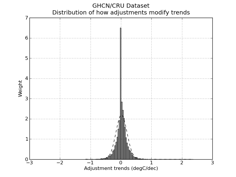
Not surprisingly, the distribution of adjustment trends2 is a quasi-normal3 distribution with a peak pretty much around 0 (0 is the median adjustment and 0.017 C/decade is the average adjustment – the planet-warming trend in the last century has been about 0.2 C/decade). In other words, most adjustments hardly modify the reading, and the warming and cooling adjustments end up compensating each other1,5. I am sure this is no big surprise. The point of this analysis is not to check the good faith of people handling the data: that is not under scrutiny (and not because I trust the scientists but because I trust the scientific method).
The point is actually to show the denialists that going probe after probe cherry-picking those with a “weird” adjustment is a waste of time. Please stop the nonsense.
Edit December 13.
Following the interesting input in the comments, I added a few notes to clarify what I did. I also feel like I should explain better what we learn from all this, so I add a new paragraph here (in fact, it’s just a comment promoted to paragraph).
How do you evaluate whether adjustments are a good thing?
To start, you have to think about why you want to adjust data in the first place. The goal of the adjustments is to modify your reading so that they could be easily compared (a) inter-probes and (b) intra-probes. In other words: you do it because you want to (a) be able to compare the measures you take today with the ones you took 10 years ago at the same spot and (b) be able to compare the measures you take with the ones your next-door neighbor is taking.
So, in short, you do want your adjustment to siginificatively modify your data – this is the whole point of it! Now, how do you make sure you do it properly? If I were to be in charge of the adjustment I would do two things. 1) Find another dataset – one that possibly doesn’t need adjustments at all – to compare my stuff with: it doesn’t have to cover the entire period, it just has to overlap enough to be used as a test for my system. The satellite measurements are good for this. If we see that our adjusted data go along well with the satellite measurements from 1980 to 2000, then we can be pretty confident that our way of adjusting data is going to be good also before 1980. There are limits, but it’s pretty damn good. Alternatively, you can use a dataset from a completely different source. If the two datasets arise from different stations, go through different processings and yet yield the same results, you can go home happy.
Another way of doing it is to remember that a mathematical adjustment is just a trick to overcome a lack of information on our side. We can take a random sample of probes and do a statistical adjustment. Then go back and look at the history of the station. For instance: our statistical adjustment is telling us that a certain probe needs to be shifted +1 in 1941 but of course it will not tell us why. So we go back to the metadata and we find that in 1941 there was a major change in the history of our weather station, for instance, war and subsequent move of the probe. Bingo! It means our statistical tools were very good in reconstructing the actual events of history. Another strong argument that our adjustments are doing a good job.
Did we do any of those things here? Nope. Neither I, nor you, nor Willis Eschenbach nor anyone else on this page actually tested whether adjustments were good! Not even remotely so.
What did we do? We tried to answer a different question, that is: are these adjustments “suspicious”? Do we have enough information to think that scientists are cooking the data? How did we test so?
Willis picked a random probe and decided that the adjustment he saw were suspicious. End of the story. If you think about it, all his post is entirely concentrated around figure 8, which simply is a plot of the difference between adjusted data and raw data. So, there is no value whatsoever in doing that. I am sorry to go blunt on Willis like this – but that is what he did and I cannot hide it. No information at all.
What did I do? I just went a step back and asked myself: is there actually a reason in the first place to think that scientists are cooking data? I did what is called a unilaterally informative experiment. Experiments can be bilaterally informative when you learn something no matter what the outcome of the experiment is (these are the best); unilaterally informative when you learn something only if you get a specific outcome and in the other case you cannot draw conclusions; not informative experiments.
My test was to look for a bias in the dataset. If I were to find that the adjustments are introducing a strong bias then I would know that maybe scientists were cooking the data. I cannot be sure about it, though, because (remember!) the whole point of doing adjustments is to change data in the first place!. It is possible that most stations suffer of the same flaws and therefore need adjustments going in the same direction. That is why if my experiment were to lead to a biased outcome, it would not have been informative.
On the other hand, I found instead that the adjustments themselves hardly change the value of readings at all and that means I can be pretty positive that scientists are not cooking data. This is why my experiment was unilaterally informative. I was lucky.
This is not a perfect experiment though because, as someone pointed out, there could be a caveat. One caveat is that in former times the distributions of probes was not as dense as it is today and since the global temperature is calculated doing spatial averages, you may overrepresent warming or cooling adjustments in a few areas while still maintaining a pretty symmetrical distribution. So, to test this you would have to check the distribution not for the entire sample as I did but grid by grid. (I am not going to do this because I believe is a waste of time but if someone wants to, be my guest).
Finding the right relationship between the experiment you are doing and the claim you make is crucial in science.
Notes.
1) Nick Stockes, in this comment, posts an R code to do exactly the same thing confirming the result.
2) What I consider here is the trend of the adjustment not the average of the adjustment. Considering the average would be methodologically wrong. This graph and this graph have both averages of adjustment 0, yet the first one has trend 0 (and does not produce warming) while the second one has trend 0.4C/decade and produces 0.4C decade warming. If we were to consider average we would erroneously place the latter graph in the wrong category.
3) Not mathematically normal as pointed out by dt in the comments – don’t do parametric statistics on it.
4) The python scripts used for the quick and dirty analysis can be downloaded as tar.gz here or zip here
5) RealClimate.org found something very similar but with a more elegant approach and on a different dataset. Again, their goal (like mine) is not to add pieces of scientific evidence to the discussion, because these tests are actually simple and nice but, let’s face it, quite trivial. The goal is really to show to the blogosphere what kind of analysis should be done in order to properly address this kind of issue, if one really wants to.
thanks. very good analysis.
though i fear the “sceptics” will ignore it…
Giorgio this is a nice analysis that shows that the adjustments appear to be near normally distributed with a mean close to zero for the station data. However this still leaves unresolved the question of how these adjustments propagate through to a global ‘average’ temperature. The geographic spread and local densities of stations is very uneven. It is still possible to have a near normal distribution of adjustments with mean close to zero that still propagates through to an overall positive correction to the global trend.
It also leaves unresolved, for me at least, the nature of the algorithm and it’s operation with regard to the adjustments. As a scientist can you tell me that there is nothing odd with the adjustments that have been highlighted for Darwin. There may be similar issues with other stations.
Now it might be that by luck we end up with a near normal distribution centred on zero (unlikley given the number of stations) or perhaps there is something inherent in the algorithms for the adjustments that [produce this distribution. I don’t know the answers.
Honestly, I don’t see how this is possible. I suppose technically it would be possible to adjust the data so to change local events, for instance making sand deserts even hotter and poles even colder. That would create alarm and yet leave average zero. But then again, you can test that if you want. The file v2.temperature.inv contains the coordinates of all stations and in the zip I link there is a text file called result.txt containing all the adjustments.
Yes, I think there is nothing odd. There are about 6000 probes out there only in the CRU dataset. A few of them will be at the extreme sides of the distribution I show here and will look suspiciously too warm or too cold. That is actually exactly what you expect, though. If I were to find anything but a normal distribution then I would actually be worried. I am pretty sure a test like this one is done and maybe even published by GHCN itself. Normality test are routine way to check for bias.
I think a more insightful analysis would identify how adjustments affect trends. Given three temperatures: 22, 23, 24; make two adjustments to yield: 24, 23, 22 and while the change fits nicely into your analysis the effect is somewhat more significant… Would you agree?
JR
@John Reynolds
Hi John – sorry I am not sure I understand what you are suggesting. I already calculated the trend of adjustment per decade so to take into account not only the steepness of the adjustment but also the duration. Is that what you are saying?
I think what I was looking for can be found in the graph labeled Mean Annual GHCN Adjustment at:
http://statpad.wordpress.com/2009/12/12/ghcn-and-adjustment-trends/
John, the relation between the Romanm analysis and GG’s is this. There are two variables – station and year. Romanm calculates a summary statistic over stations (average) and graphs it by year. GG calculates a summary stat by year (trend) and shows the distribution over stations.
GG then calculates a summary stat over stations – the average, 0.0175 C/decade. The corresponding stat for Romanm is the trend over time, and it’s best to weight this by number of stations (in each year). That comes to 0.0170 C/decade. That’s the average slope of his curve.
It’s just two ways of looking at the same data. Completely consistent.
Nick-
I think you miss the significance of Romanm’s analysis. Yes, his graph shows ~ the same average slope of 0.017 C/decade. However, by graphing this over time, you can see that this average is composed of a significant downslope prior to ~1910, followed by a significant upslope after ~1910.
In other words, the adjustments reduce the appearance of global warming before ~1910, and increase it’s appearance afterwards ( up until ~1990, at which point there is a strange drop.)
There may be valid reasons for the adjustments, and even a valid reason that they slope down before 1910 and up afterwards. But it is not enough to say that since they mostly cancel each other out then they are not significant.
Another important consideration is the spacial distribution of the adjusted data. If 1% of the total useful stations is used to describe 10% of the total area while 20% is used to describe 2%, a serious bias could be introduced while leaving the distribution of adjustments overall as you describe.
Lou
@Lou. The scenario you describe would have an influence on the GCM models where data are fed by grid so the bias should technically be calculated grid by grid. A cheat like this would be very easy to test though. It would be enough to check the distribution of the adjustment of only the last 20 years when the spacial density of stations is much higher.
We need a volunteer…
gg, your method is a nice idea, so assuming you did it correctly, it’s a good contribution. Want to repeat it for GISS and GHCN?
In case it gets lost in the thread at WUWT, I recommend you look at a similar effort, Peterson and Easterling, “The effect of artificial discontinuities on recent trends in minimum and maximum temperatures”, Atmospheric Research 37 (1995) 19-26. They look at the overall effect of GHCN homogeneity adjustments on mean trends in the entire NH, and then different regions. They see small effects for max temps on a hemisphere-wide basis; no effect for min temps. Surely somebody has published something similar more recently, but it’s what I have on hand.
Also, they note that adjustments won’t necessarily be random. For example, if many sites in a country switch from old to new thermometers at about the same time, that’s very much a non-random effect in that country at that time.
@carrot eater. Thanks for the reference. I’ll look at it. I am not surprise to see data like this are published. My all point was just to highlight the fact that if one wants to find out misbehaviour in adjustments oughta look at the big pictures, not the single probes.
Is this an evaluation of each decade of each station, or an evaluation of the overall trendline of the station data? Is there some approach here to resolve which decade the station data set is applicable? Adjustments plotted from individual stations generally indicate pre-1960 trend adjustments to effect the trend in the opposite direction than the post-1960 adjustments. Just trying to understand what presented here.
@crashexx. Overall trendline, then divided by decade. You could do it decade by decade and split the data: I’d expect to see most corrections in former times, when readings were more prone to errors.
Amazing work. As a skeptic of both sides of this debate I think the urban heating issue is overblown and that Anthony Watts should indeed release the fifteen minute plot that likely disproves the hypothesis of his whole folk science surface station project! Only a few actual cities show visually anomalous warming versus a linear trend going back ~ 300 years. That’s bad news for both sides since it’s really hard to explain why so many old cities with continuous records show neither pronounced urban heating nor a strong AGW signal (see: http://i47.tinypic.com/2zgt4ly.jpg and http://i45.tinypic.com/125rs3m.jpg). Only a few of the dozen or two very old records show excess warming in recent times. Having thus “proven” that both sides are trying to bully the slow warming trend of the centuries I hereby declare nuts. When one side wants to sell me hockey sticks made of exotic non-linear-growth wood and the other wants to sell me a conspiracy theory, I grab for my thermometers!
That said, your presentation is incomplete. You haven’t submitted the actual numerical % bias either way which is something the eye can’t measure. If there are corrections for urban heating there should be a clear bias for downward adjustment. Not being a Python user I only have your image to rely on..so..I integrated its pixels and still cannot tell if there is + or – bias since my pixelation correction is suspect.
If there is indeed no negative bias as you claim then it means urban heating is not being addressed at all, does it not? The skeptics claim that’s exactly the problem so unless you post a positive number (% bias) then you are in fact supporting their argument and only attacking straw man claims that there is a massively obvious hoax going, where in fact a very subtle and even subconscious one involving observation bias is the real suspicion.
See: http://i48.tinypic.com/2q0t47q.jpg
What’s that number?
@NikFromNYC. In the zip file I link at the end of the post there is a file called result.txt with all the adjustment. It’s CSV formatted so you can actually open it with anything you like, excel or matlab or whatever you use. From a mathematical point of view, the actual number of adjustments is not really important though, what it is important is the overall result. I checked right now, though: out of 6533 measures, 845 are = 0; 2490 0.
The simplest result is that the average of 6737 adjustments in your results.txt file (with 204 having no values calculated) is + 0.017. Over 100 years wouldn’t that turn out as 0.017 X 100 = 1.7° C warming added due to adjustment? I’m not sure exactly what your adjustment value is calculated as. I’m assuming slope (degrees/years). The vast majority of adjustments are randomly distributed as expected, but a urban heating adjustment would not be random and should never be positive (am I wrong?), so we should see a negative adjustment overall, not positive.
An added 1.7° per century warming slope is due to adjustments? Is my slope calculation correct?
What it the right way to analyze such results? Hmmm…. I’ll have to mull that over, not being a statistician. Here’s a quickie analysis.
The average + adjustment = 0.103
The average – adjustment = -0.092
Both round to 0.1. So the strength of adjustments raises no eyebrows.
Number of + adjustments = 3198 (28% more than the number of – ones!)
Number of – adjustments = 2490
Number of 0 adjustments = 845
Non-zero adjustments that are + = 56%
Non-zero adjustments that are – = 44%
If my analysis is correct, your declaration of victory was premature.
I see your histogram and raise it with a pie chart:
http://i50.tinypic.com/14ttyf5.jpg
Yet this doesn’t jibe with your histogram at all. What am I missing? Is your histogram reproducible? I’m not up to speed with Excel on making one. Ah, I misunderstood it somewhat. My linear pixel count didn’t weight the pixels with their adjustment value. Sure, there are a lot more *tiny* negative adjustments (the huge peak in the center is just to the left of 0) but there is a heavier number of bars indicating large positive adjustments than large negative ones. It’s not the big center of near neutral adjustments that matter, but the outer bars that matter and clearly, by eye, one can see that the positive side has more substance to it than the negative side. If you squint. Sorry I don’t see it as clearly now, by eye. Ah…here we go! Just erase the two center peaks which are both near-zero corrections anyway:
http://i50.tinypic.com/16m51qc.jpg
Now you don’t have to squint.
I kind of lost you with all this histogram thing.
The average is 0.017 per decade, that makes is 0.17 per century (about 8.5%).
The fact that positive adjustment outnumber negative adjustments, as I just said, doesn’t mean much because they add up to zero. I don’t know how I could explain this any further, it seems very basic math to me.
Ah…it is indeed labeled degC/dec. The argument now only amounts to the “glaring fact” that no negative correction for urban heating is evident as I had expected. Looking into it though, I believe it’s GISS that does urban heat adjustments instead of GHCN so you have indeed shown that there is no great bias, overall, in GHCN adjustments despite the fact that individual stations may show seemingly suspicious adjustments. GHCN seems to only adjust for time of observation (TOBS), missing data estimation (FILNET), station history (SHAP), and transition to electronic thermometer units (MMTS).
So I have “the number”: GHCN adjustments add a non-trivial but unsuspicious 0.17° C per century. That represents 8.5% of a “2° rise per century”.
Though positive adjustments out-number negative ones by a large margin (12%), and though the histogram presented hides this fact, the magnitude of the adjustments are quite small so the histogram is fair play.
If the magnitude of adjustment was quite large, using such a histogram to hide a 12% positive bias would be fraudulent, since it would indeed quite effectively hide it.
The only remaining conspiracy might be to retain the slope of individual stations while altering them to crowd all of the warming into the last decade or two to support AGW theory. To do that without changing the slope by more than 0.17° C per century would require the determined and self-aware logic of a whole army of devious psychopaths and could not be created through mere observation bias or rogue “over enthusiasm” that played out within the limits of TOBS, FILNET, SHAP and MMTS adjustments. Thus your work exonerates GHCN from accusations that tweaks to individual stations have been used to hide a proverbial lack of recent warming.
1) Do land air temps even tell us that much about global average temp? I don’t see how they could be called on to do much more than give a hint of a trend. If there really is such a thing an an urban heat island effect I don’t see how you could hope to adjust for that without losing your evidence for the trend.
2) I can see a way that the above analysis would be insufficient. You’ve mentioned two different processes – adjustment and “homogenization.” If I understand correctly what “homogenization” means, it seems that you should first have to calculate how much weight each station is given after the “homogenization” process. It’s not hard to imagine a scenario where systematic homogenization becomes systematic upward temperature adjustment. As I indicated in my first paragraph, average air temperatures from land readings don’t tell us that much about average global temperature to say nothing of the real thing that should be considered – average global heat.
There is also an interesting semantic question here. If a denialist accuses a climatologist of falsifying data does that mean the denialist is suggesting something nefarious? I would say no. Data can easily be falsified unwittingly by careless scientists who are unmindful of issues like confirmation bias (for more info on types of bias see Sackett DL. Bias in analytic research. J Chronic Dis. 1979;32(1-2):51-63). The question I have is: are climatologists careful scientists?
I am not going to answer points 1 and 2 because I am not sure I understood what is the link with the discussion we are having. It seems to me we moved to “thermometers are not useful anyway“.
I am going to answer to the following point, though.
Climatologists are not different from any other scientists. I am no climatologist myself, I am neurobiologist, and as I wrote in the post I don’t really care to know about the single scientists. In fact I do know that most of my bio-colleagues are not less assholes than average Joe in the street. That is not the point. You don’t have to trust scientists as people, you have to trust the scientific method. I can ensure you that if tomorrow I publish a paper about a new theory of sleep (which is what I work on) plenty of other scientists will start to work FULL TIME to try to find flaw in my theory and kick my ass because the competition in Science is bloody – money are a very limited resource + scientists tend to have big ego. The same has happened and happens every day in any other field of science, including climate change. After you know how actually difficult it is to buid a consensus, you start to appreciate also how valuable it is. What sceptics do is to forget or ignore all this.
I think a post like the one I just wrote – and the comments that arose from it – show that if the question is well posed and if the problem is well addressed, it can be actually very easy for people to come out with good tests for genuinity of data. Many sceptics lack the ability to understand what the question is and how to address it, possibly because they lack the forma mentis. What Willis Eschenbach did may even be methodologically sound but it is still pointless. If you want to test the hypothesis “are data good?” there is no point whatsoever going after single probes. If data are somehow loaded, then you would see that from the big picture, like I did.
gg, you stated, “…you have to trust the scientific method.” Excellent point! But where is the scientific method in any of this? Please show us. The scientific method is based in part upon the obligation of cooperation, and full transparency of all of the data and methodologies, and any other information used to construct a hypothesis, so that skeptical scientists [the only honest kind] can reproduce and test their experiments with the methods and data they used to arrive at the hypothesis, which claims that AGW is caused primarily by human emitted CO2.
But the purveyors of that hypothesis still adamantly refuse to cooperate with requests for data and/or methods used by the CRU, Michael Mann and others in their clique.
Throughout their leaked emails they are seen to be putting their heads together and strategizing on how to thwart legitimate requests for their data and methods, to the point that they repeatedly connive to corrupt the peer review journal system and destroy data, rather than cooperate with even one of the many dozens of lawful FOI requests.
Therefore, there is NO scientific method being practiced by the promoters of this hypothesis. There is only their public conjecture, supported by secrecy. Only their partners in crime are allowed to be privy to their information; conversely, it may be that there exists little legitimate data, and they have been winging it with cherry-picked, massaged numbers that are so corrupted that disclosing them would make these government scientists a laughingstock within the broad scientific research community.
Until the taxpayer-funded catastrophic AGW purveyors fully and transparently cooperate with others, everything they say is suspect. Their endless barking takes the place of the science they purportedly used to arrive at their questionable conclusions.
The enormous amounts of grant money being funneled to only one side of the debate [the AGW side] by numerous Foundations with an AGW agenda [Heinz, Grantham, Tides, and many others] and by billionaires has thoroughly corrupted climate science, and its associated peer review/journal process. How could it not? As you point out, scientists are people and money is a limited resource.
In Mr Eschenbach’s defense, he is as unpaid for his efforts as were Albert Einstein, Ignaz Semmelweiss, and numerous other amateur scientists. Unlike the CRU crew, Mr Eschenbach has willingly answered questions, and he has admitted when he was in error — quite unlike the mendacious Michael Mann, for example, whose hockey stick chart has been so thoroughly debunked that it can no longer used by the UN/IPCC in their assessment reports [and make no mistake: the IPCC LOVED Mann’s hockey stick chart. It was far better visually than any of the pale imitations that are now published in its place.] To this day Mann refuses to cooperate with others regarding his data and methodologies — the sign of a scientific charlatan.
You ask, “are climatologists careful scientists?” Based on the exposed internal emails and code, the answer is obviously: No. But the excuse of sloppiness gives far too much wiggle room to these conniving grant hounds. For example, this from the Harry_Read_Me file:
“Here, the expected 1990 – 2003 period is missing – so the correlations aren’t so hot! Yet, the WMO codes and station names/dates are identical (or close). What the hell is supposed to happen here? Oh, yeah – there is no ’supposed’, I can make it up. So I have.”
They are sloppy scientists. That is obvious throughout their code comments. But they are more: they are dishonest scientists who invented temperature data out of whole cloth; they made it up. And that is the reason they refuse to cooperate, as the scientific method requires. If they cooperated, their gaming of the system for money and status would be exposed to the world. So they stonewall. It is their only option.
I agree that your analysis is good, clever, and useful. I apologize for not incorporating that in my original comment.
I think the statement that confused me is this:
“Adjustments and homogenitations are necessary in order to be able to compare or pull together data coming from different stations or different times.”
I took that to mean that two separate operations were being done. I will admit I didn’t not read your entire post carefully.
On the issue of carefulness: I would prefer to trust the methods of engineers to scientists, and if we are building climate models with so much staked on their correct operation, I wonder if that is really an exercise in science or in engineering? My impression is that scientists will gamble more than engineers because they are often seeking recognition from a breakthrough or a discovery; an engineer, on the other hand must do what he does safely and economically. I am not saying that there is not science to be done to establish certain climate processes and climate numbers, but perhaps there is time to do it all carefully. Do we really know how urgent the climate crisis is? I understand that the sea is swallowing Venice but surely part of that problem is because land under Venice is subsiding and will continue to subside regardless of what happens to sea levels.
There are several types of adjustments made to the data: hommogenization, which is the combining of several records for the same station to eliminate the effects of station moves and equipment changes; TOD adjustments, which are made to account to changes in the time of day that readings are taken; and urban heat island corrections which are done by GISS, but not anyone else to my knowledge. Since gg is analyzing the GHCN data he is only looking at homogenization.
This is a very nice analysis, and is really the last word on this entire fabricated scandal.
It demonstrates beyond any reasonable doubt that there has been no data manipulation. Even if one were to persist in claiming manipulation, one would still have to accept that the average trend from CRU is less than 10% different than the average trend of the raw data. (I’ve done a similar analysis (though in a slightly different way – we’ll have a post on this on RealClimate) — and we get the same result.)
It has been claimed that ‘possible adjustments’ to the data could change our estimates of climate sensitivity. As I’ve explained elsewhere*, this is false. But even supposing it were true, it would only be a 10% adjustment of so.
Does anyone seriously think that international policies on climate change should be different because the expected temperature rise by 2100 might be 4.5 C instead of 5.0?
All of this demonstrates that global warming is real and unequivocal.
*http://www.realclimate.org/index.php/archives/2009/12/who-you-gonna-call
Eric, I don’t know of anyone who doesn’t think global warming is real and unequivocal. There may be some though. gg’s analysis is nice and shows that whether adjusted or unadjusted you would come to a very similar global average temperature. Of course this is not evidence that the adjustments are correct, simply a statement that the various adjustments that are made don’t put a large bias into the estimate of global temperature rise. Neither is it a statement that the estimate itself is correct. It may be more or less but I doubt that it is significantly different from any of the estimates out there.
For me the real questions centre on attribution and the millenial scale variability of the climate system. I think there are real debates to be had here and this is where we need to put real effort into resolving the outstanding questions. If we can make progress here then we might be able to begin to answer the climate sensitivity question and make robust estimates of temperature rises in 2100.
“I don’t know of anyone who doesn’t think global warming is real and unequivocal. There may be some though.”
Judging from what I see on the internet, there are lots of very loud people out there who doubt pretty much any and every aspect of the current theories of climate. Including this.
‘..the last word’ another closed mind from the Real Climate guys, I guess.
I do like this article and analysis – very helpful and I am glad to see a positive response from Willis Eschenbach and a further thought by Roman M
But like others have said here I don’t think there is an argument about global warming, – the argument is about Man made global warming and the implications of creating massive political and economic change which look like they will benefit big corporations in the West and will cripple developing and under developed nations.
So while Darwin is relevant it is not key, it may show some degree of ‘hiding the decline’ it may not.
And the bigger picture? Check it out here
Eric: I would be more impressed by your claims if you would publish at RC the change in temperature since 1850/1880/1900 and today for JUST THE LOCATIONS USED TO ARRIVE AT THE “GLOBAL” MEAN TEMPERATURE IN 1850/1880/1900. NO “global” data sets are legitimate that contain stations absent before 1910. All statements about “warmest ever” based on times series beginning in 1900 or before are FALSE given the absence of met. stations and temp. data from almost all of Africa and much of the tropics elsewhere before 1910. This is the mendacity of HadleyCRUT,GISS, and sadly also RC, using as baseline data a wholly unrepresentative sample of global mean temperature.
“If there is indeed no negative bias as you claim then it means urban heating is not being addressed at all, does it not?”
No, it doesn’t suggest this at all, unless more than 50% of the stations are urban (which they are not), and unless the urban heat island effect is large.
The urban heat island effect is minimal, as has been demonstrated conclusively.
There is little difference between the long-term rural and full set of all temperature trends.
Read this and the papers cited theirin.
http://www.realclimate.org/index.php/archives/2004/12/the-surface-temperature-record-and-the-urban-heat-island/
Well, this simple demonstration shows that UHI may not be as minimal as the papers claim:
A comparison of GISS data for the last 111 years show US cities getting warmer but rural sites are not increasing in temperature at all. Urban Heat Islands may be the only areas warming.
http://www.youtube.com/watch?v=F_G_-SdAN04&feature=player_embedded
Where can I get a full set of GISS station data? I went to the GISS site, but all I see is retrieval by individual station. I must be overlooking it somewhere.
GG:
You really want to show the distribution by decade. That will show if there is any “trend” baked in to the adjustment process.
Furthermore, as Gavin Schmidt pointed out, the CRU adjustments are not urban heat island adjustments anyway, they are simply homogenization adjustments. The urban heat island issue is separate.
So what NikfromNYC says is wrong, and so my response to him isn’t quite relevant.
But as I said, the UHI effect is demonstrated to be small. This is a strawman.
I posted a followup above which now quite strongly supports the authors conclusion.
GG: Indeed on the big picture. The deniers want to say “here is one station with a big adjustment, maybe they’re all like that”, but they don’t think to actually look at all of them. They just go on to the next individual station that fits their bill.
Can you clarify one thing? I thought these adjustments are applied by the NOAA (GHCN). I didn’t think CRU had anything to do with it. Does CRU use the GHCN adjustments, or have any collaboration in the process? I had been thinking they did their own separate adjustments.
gg I think you might have misinterpreted my comment about Darwin. I’m not surprised that there are stations that receive both large positive and negative adjustments. This we would expect from any 6000+ data set and a normal distribution. My comment related to the fact that for some periods there are 4 stations at Darwin, presumeably located at different sites, that record the same temperature. As a physical scientist I find it hard to justify an adjustment to the data given that 4 independent sets of temperature data in and around Darwin give the same annual averages.Now all these stations are recording temperature in a precise way, or they are all drifting at the same rate for whatever reason (instrumental, site factors etc.). The second option is the least likely.
gg I’ve now looked at the data and think that all the Darwin records relate to the same station. i.e. are multiple copies of a single data set so my point above isn’t valid.
I am interested to know though, when Darwin Airport first started. It surely wasn’t prior to 1920. How about 1935-1945 period?
I don’t know. Someone pointed out that before WWII the measurments were taken at the post office that was then bombed and destroyed during the war.
This seems to be the case. It’s also discussed in a link from Eschenbach’s original post.
According to wikipidia, the current Darwin airport was established as an air force base in 1940. This is consistent with the above. There was also a civilian airfield at Parap; this was closed in 1946 and civilian activity moved to the military location.
Eschenbach knew there was a site move, and didn’t want to adjust for it. Why, I don’t know.
Very cool analysis. I was hoping to do something similar during the Christmas break.
I will try to independently reproduce your results with my own code in the next few days.
@John. Thanks. You may want to take a couple of suggestions from the comments here too: I don’t think they add more information to the picture but sure enough they would be cool, especially the mapping one. If you use python, I read there is a module called geopy ( http://code.google.com/p/geopy/ ) that seems quite powerful.
I think at some point the analysis should be extended to include geographic weighting. It could also be partitioned in time to check for biases in different decades. There is a lot of work that could be done.
This is a great first step though. Instead of just picking individual stations it’s important to get the big picture by looking at all of them. Too many blogs are focused exclusively on the details and forget to step back and gain perspective.
No – you would not see if the data is loaded without looking at the adjustment through time.
Why not? He’s looking at the overall trend through all times.
I do agree that doing a proper spatial average would be the next step, but this result is itself informative for the question it is trying to answer.
BTW – John Reynolds pointed this possibility out first in this thread.
Paul Dennis: as a physical scientist, if you see four different records all labeled ‘Darwin Airport’ and all giving the exact same raw results, would you assume those are four different instruments? Seems quite likely to me that they’re duplicate records from the same instrument. Read over the GHCN documentation; they receive a lot of duplicate records.
Even in the off chance they are different instruments, they could be subject to the same errors (Time of observation change, upgrade in instrument, etc).
But in any case, the topic here is the big picture, not an individual station.
carrot I agree with you. If they all give identical measurements then I would be highly suspicious of the analysis, and also of GCHN quality control.
In a sense I’m playing devils advocate here because I think gg has made an interesting analysis that does not really get at the heart of the issue with respect to homegenization of data sets.
I think gg is saying that because the adjustments are normally distributed and centred close to zero then they don’t affect the overall estimation of global temperature. i.e. one could take both the adjusted and un-adjusted data and arrive at the same estimate. This does not mean that both the adjusted and unadjusted estimate are correct. What one needs to do is examine the adjustments on a case by case basis.
I do think however, before gg comes back at me over this point, that we might expect the adjustments to be normally distributed around zero. Stations may move to higher elevation, others to lower, changes in sensors might lead to normally distributed corrections around zero too. However, what we expect and what might be true may be different things. I have an open mind on this one.
carrot I’ve just looked at the Darwin plots at the NASA GISS web site and agree that they are probably the same station with multiple records, or perhaps several instruments at the same location.
Right. I’d think it more likely it’s multiple copies of the same data; even two different instruments at the same general location would give slightly different results. Somebody claiming to be from the BoM has mentioned that the station was moved around the airport grounds a couple times; perhaps there are duplicate records to show the overlap periods around the moves, I don’t know. We’ll see. All I know is that the GHCN often receives duplicate data; at some point it merges them together.
Either way, Eschenbach is sloppy here. He didn’t consider the possibility that those records were duplicates. He then wonders why adjustments were made. Well, he read how they’re made. He should have shown data from neighboring stations – a reference network. He didn’t do that, and instead just launched claims of fraud. Bizarre behaviour.
It’s as if he paid lip service to learning how homogenisation works, and then promptly forgot everything he read.
gg I’m not sure what Eschenbach did could be described as pointless.
If I understand you correctly your argument is that since the adjustments across all stations are normally distributed and centred close to zero then the overall effect on the global temperature is zero. I agree this is true if the stations are evenly distributed.
However, this is not a defense of the adjustments per se it is simply a statement that they might not affect the overall result. Now one can arrive at the right answer by the correct method, or one can arrive there by an incorrect method. However, if the method is incorrect then you have no way of knowing you’ve arrived at the right answer!
To evaluate the validity of adjustments it is necessary to look at individual stations. This is what Eschenbach has done. Now one station does not sustain the argument that these issues affect every station. But your dismissal of Eschenbachs approach as pointless, I contend, was in error.
Finally, you have demonstrated that the adjustments across the complete data set are slightly positive (0.17 deg/century) which is about 15% of the global temperature rise. This would seem to me to be significant.
“However, this is not a defense of the adjustments per se it is simply a statement that they might not affect the overall result.”
If they don’t affect the overall result, then what are skeptics jumping up and down about? Do we care about whether the global temperature trend is sound, or do we care about something unrelated?
You need only read the comments at WUWT to see what most so-called skeptics think Eschenbach’s analysis proves.
Finally, you have demonstrated that the adjustments across the complete data set are slightly positive (0.17 deg/century) which is about 15% of the global temperature rise. This would seem to me to be significant.
You left off a zero. The adjustment is 0.017 deg/century. That’s less than 2% of the observed trend.
Oops, I didn’t notice that you were talking about deg/century rather than deg/decade. My bad.
It is pointless because what do we learn from it? Eschenbach took Darwin as an exemple of ~6000 and concluded that (Fig 8 in his post) Darwin went through 4 adjustments in the last 60-70 years and they all happend to be positive? So what? What if instead of Darwin he had took BAMAKO/SENOU AIRPORT (12761291000). Also remote (Mali, Africa), also an airport, some degree of adjustment per decate only opposite sign (-0.24 instead of +0.24). This is how it’d look like:

What do we learn? That people in Africa “cheatt” to hide global warming? This is just a random station from those with symmetrical trend in the adjustment. I am sure you will be able to find extreme cases in one or the other directions.
The average adj I see is 0.017 per decade. If the trend of the 1900 is 0.19 per decade, that means not 15% but less than 10%. Must say I wouldn’t trust 0.017 as to be a faithful measure because I suppose not all stations were used: could be a bit more, bit less. If I were to do the analysis on the first place I would discard all stations on the left and right tails of the distribution if there are others more reliable to be used in the same grid.
“If the trend of the 1900 is 0.19 per decade”
Is there a typo in that sentence? Do you mean trends of the 1900s or 1990s?
Yes, there is a typo. It is 1900, meaning from 1900-2000. If I remember correctly is about 0.19 per decade isn’t it?
gg, didn’t see a reply button on your comment, so I’ll reply to myself.
If you mean global, it’s about 0.65 deg/century plotted as OLS, according to HadCRUT3, with faster rates from ~1910-1945 and from ~ 1975-2000.
http://www.woodfortrees.org/plot/hadcrut3vgl/from:1900/to:2000/plot/hadcrut3vgl/from:1900/to:2000/trend:2000/plot/none
Simple, yet excellent analysis. Not that the contrarians will care, but rational people sure will take notice.
Very interesting work here.
So, here is my understanding of what you are saying:
The problem:
Here is a good quality temperature data that shows no warming trend from Darwin, Australia. I fact, there are lots of stations in Australia that show no warming trend at all.
Despite that, after processing this data shows significant warming trend.
The solution:
There is nothing wrong with that because warming adjustments to the data are counterbalanced by symmetrical adjustments in opposite direction elsewhere.
Am I the only one who see a problem with this line of reasoning?
What you just did is showed that even if your processing assumes that 2=3 it’s OK because somewhere else it assumes that 3=2
“Urban Heat Islands may be the only areas warming.”
This is probably the stupidist statement I have ever seen on this subject.
Please explain to me how glaciers retreating on the Antarctic Peninsula know about the temperature in New York City?
You haven’t seen the teeming cities of millions, full of black parking lots, concrete buildings and air conditioners, on the Antarctic Peninsula, Siberia, and far Northern Canada?
Eric,
Have you done any infilling of missing data in your latest analysis lately? How’s the corrigendum going to your paper that showed proof of ‘unprecedented warming’ in East Antarctica going? Is it true that it was only a coincidence that the now infamous CRU code ‘read me’ file began with the name ‘Harry’?
Haven’t you had any converstions with your fellow RC colleague Michael Mann recently? He seems to think that there is a teleconnection between bristlecone pine tree ring growth in Southern California and mean global surface temperature. If thats true then why can’t glacier’s retreating on the West Antarctic peninsular be teleconnected to temperatures in New York City?
KevinUK
Big problem with this analysis. Lowering temps in the past is the sam e as raising temps recently. Either will increase the slope of warming.
Why is it so many skeptics try to attack AGW with rhetorical devices and clever sentences…rather than hard work and um, numbers?
Unless you can post up hard numbers, you are wasting everyone’s time. Its reminiscent of the Aristotelian approach to science, that the mysteries of the world can be reasoned out by just patiently thinking about them.
Newton would not be taken seriously if he didn’t have the math to back it up, same with Einstein and Fourier (who postulated the greenhouse effect). Incidentally, modern science has found minor problems with all said scientists theories. Perhaps if large business interests were threatened by Einstein’s theory of general relativity, we’d be hearing about how much of “fraud” he was since quantum mechanics had proven his theories inoperable at the sub-atomic level.
Your conclusion doesn’t follow from your data. Imagine a site that had constant temperature – if I adjust the data from 1950 by -1 and the data from 1990 by +1, I’ve created a warming trend where none existed while still having a 0-mean adjustment.
You don’t understand what was done here. It’s a distribution of trends, not a distribution of adjustments.
So in your case, there would be a warming trend, and it would appear as such above.
You’re right, I don’t understand. You’re saying the graph titled “Distribution of adjustment values” is not in fact a distribution of adjustments? I read it as saying there were (approximately) the the same number of positive as negative adjustsments – is that not what it’s saying?
No, you have created two trends, one descending and one ascending that average each other to zero so at the end you haven’t created a warming trend at all. See my answer to Mesa 4 or 5 comments below this.
Read more carefully what he did. He’s finding the trend introduced due to adjustments, not each individual adjustment. Look at the distribution – it’s of degrees/time.
An example indeed can be imagined of a linearly inclined slope having a kink put into it so the first 90 years become perfectly flat and the last 10 years super steep while retaining the exact same slope (so “adjustment” = 0).
But it’s a new level of conspiracy to keep the slope the same, one that less easily passes the laugh test since I mean once you’ve tugged at the data a bit or neglected to correct anything but upticks, would you really go to the eccentric trouble of going back and fixing the slope? Only a gatekeeper scenario might allow such coordinated fudging and I’m not sure GHCN has such a figurehead.
Besides, only 1 in 8 adjustment are zero value. They average to 0.1 magnitude (per decade) and max out at 1.5-2. So you’d have to adjust the slopes in a *coordinated* manner to achieve an overall near zero effect. Some would have to be +0.06 and then be matched by ones at -0.06 (or two at -0.03). Keeping slopes the same (“adjustment” = 0) would be relatively easy (but quite eccentric) but if you do alter the slope as the vast majority of adjustments do then how do you decide in an individual case what to adjust it to in order to hide your work? And you have to do this while adding real corrections too that limit what you can do to overall slope.
The study that would detect “coordinated slope deception” would be a graph the difference in raw vs. corrected data over time (not a slope study).
Here is someone’s plot of USHCN’s (US Historical Climate Network) adjustments:
http://cdiac.ornl.gov/epubs/ndp/ushcn/ts.ushcn_anom25_diffs_urb-raw_pg.gif
But this article is on GHCN (Global Historical Climate Network). At this point I’m lacking enough homework to know the difference. I’d like to see the relevant plot though. If it shows an incline then cognitive dissonance will rule the day.
But indeed this study doesn’t rule out fraud. It just makes it seem very unlikely for this database.
Again, the dimension of time is completely absent from this analysis. Since what we are talking about is the time series of temperature, it renders the analysis completely meaningless. The residual trend from the distribution depends on how it is ordered in time. Why is this a difficult point to grasp? It may well be that there is nothing to it, but it needs to be analyzed.
I see you keep saying that but I think you are confuse. I am taking the entire trend of the adjustment here and dividing it per decade just so to be able to do comparisons.
Think of a themormeter for which we have 100 years worth of data: from 1900 to 2000. Now imagine that this thermometer always measures 25C, constant, as in a flat line. This is your raw data.
Now, create a cooling adjustment in 1925 of -1 and then again a warming adjustment of +1 in 1975. Draw this on a piece of paper if it helps.
What is the trend of the raw data over 100 years? 0
What is the trend of the adjusted data over 100 years? 0
What is the trend of the adjustment itself? 0
There is no way you can get a total trend different than 0 if the trend of the adjustment itself is zero. OK?
The only reason why temporal data may be somehow important is because in former times when probes were not so many, the distribution of adjustment trends per grid might have been not homogeneous but we are talking little bits here.
So the raw data shows a constant 25 and after adjustment, you have a temp of 24 in 1925 and a temp of 26 in 1975. That looks like a 2 degree warming trend over 50 years, even though the individual adjustments sum to 0 and the raw data has no trend.
What am I missing?
No, you have a temperature of 24 in 1925 and then again a temperature of 25 in 1975. You do -1 (25-1=24) and then +1 (24+1=25).
Yes, you now have a temperature of 24 from 1925 until 1974, and a temperature of 25 from 1975 onward.
Now suppose this data set is observed between 1950 and 2000. Clearly, a 1 degree temperature trend will now be observed from 1950 to 2000. This is 2 degrees per century trend that was just created.
“Now, create a cooling adjustment in 1925 of -1 and then again a warming adjustment of +1 in 1975. Draw this on a piece of paper if it helps.
What is the trend of the raw data over 100 years? 0
What is the trend of the adjusted data over 100 years? 0
What is the trend of the adjustment itself? 0”
It seems to me that you are using “trend” to mean “change in average temperature over 100 years” whereas everybody else will be interpreting it to mean “change in average annual temperature over 100 years”.
If you cool 1925 and warm 1975 then, yes. the 100 year average temperature is not affected. But if you draw a “line of best fit” to the annual temperatures – which is what the IPCC refer to when they talk of a “trend” – then you will see a positive slope i.e. a warming trend.
Paul Dennis,
“Giorgio this is a nice analysis that shows that the adjustments appear to be near normally distributed with a mean close to zero for the station data. However this still leaves unresolved the question of how these adjustments propagate through to a global ‘average’ temperature.”
That question gets partial resolution here:
http://www.ncdc.noaa.gov/img/climate/research/ushcn/ts.ushcn_anom25_diffs_urb-raw_pg.gif
This is for the USHCN, which is a substantial sub component of the GHCN. Everone will note that the trend introduced by the adjustments is not ‘normally distributed and centered on zero’.
Evidently, the ‘last word on this fabricated scandal’ has yet to be spoken, True Believer’s wishes notwithstanding.
The maths involved are complex, and often do not operate intuitively. That holds true for the intuition applied to ‘adjustment distributions’ every bit as much as it does to the intuition applied to extreme homogenizations of single stations.
To get what you want, gg would have to do a spatial average. I bet it’s out there somewhere, though; it’d be pretty simple to show if you have the code for that already. Review the paper I cited by Easterling and Peterson, 1995 above – they do this calculation for the Northern Hemisphere. I’m sure somebody has done it globally more recently, but I haven’t found it yet.
But if nothing else, I think it’s safe to conclude that Eschenbach has shown absolutely nothing. He found a single station with a sizable adjustment. That’s it. He put zero effort into doing anything further – in terms of understanding why those adjustments were made, or in terms of the big picture, as we’re looking at here.
The GHCN raw dataset consists of more than 13000 stations, but of these only about half (6737) pass the initial quality control and end up in the final (adjusted) dataset.
For the sake of clarity could you explain this staement further?
Excellent work. This is the type of analysis the deniers should be doing if in fact they want to determine whether there’s some sort of systematic bias in adjusted thermometer readings. Come to think of it, how do we know they haven’t performed this type of analysis?
gg,
First of all I’m struggling with some of your basic station count numbers. Could you confirm where you downloaded your GHCN dataset from? GISS or NOAA? When did you download it. What do you count as a station? A station as given in the GHCN v2.temperature.inv file or a WMO station? Please note that the adjustments are applied to a WMO station
Also do you understand the central limit theorem? Are you aware that its perfectly possible to combine several distributions that have non zero means and none normal distributions so that when combined they approximate to a normal distribution. I think you’ve got a lot more work to do yet to reach the conclusion you have reached in your ‘big picture’ conclusion that these is ‘Lots of smoke, hardly any gun and that climatologists don’t falsify data?’. I’ve been doing my own analysis of the GHCN dataset looking for bias so I’m keen to first check that we’ve both kicked off on the same playing field before we play out the rest of the match. I know you provided Python scripts but more details as to exactly how you produced the result that goes into your histogram chart would be much appreciated.
KevinUK
I don’t think the central limit theorem’s conditions are satisfied here. I don’t think the adjustment distribution gg’s found is actually normal; it’s too leptokurtic. So working from the assumption that the central limit theorem applies strongly here is probably wrong.
Even if it did, it doesn’t imply that combining distributions with non-zero means will get you a normal distribution with a zero mean. If the “several distributions” tended to have means bigger than zero (which is what you’d expect if climatologists systematically increased the adjustments), combining them would still give you a distribution with a mean bigger than zero. The distribution gg’s pulled out is only a tiny bit bigger than zero; that’s gg’s point, as far as I can tell, and appealing to the central limit theorem doesn’t change that.
By “The distribution gg’s pulled out” I of course meant “The mean of the distribution gg’s pulled out”.
Yes dt, that is exactly my point. Thanks for clarifying it for me.
@KevinUK, I wrote in the post which files I downloaded and where from. There is link. For this kind of analysis I don’t need to care what the definition of a station is, since the goal here is to check whether scientists protocol introduces a warming bias or not so we put everything that it is both in the mean and mean_adj file, without caring too much on what it is.
[…] and Adjustment Trends Jump to Comments In his blog post, Giorgio Gilestro claims to show that the adjustments t made by GHCN to temperature data do not […]
Mesa anfd the others are right. The graph in the head cannot possibley show temporal features and the argument that the adjustments average out over time sheer arm waving.
I did some analysis on the data and posted it here:
http://statpad.wordpress.com/2009/12/12/ghcn-and-adjustment-trends/
the last graph is particularly interesting.
Thank you RomanM,
If the whole point is that adjustment produces warming,
why don’t you simply plot all stations raw vs all stations adj on the same graph.
I was going to do it myself but it seems you already have everything there and you can do it faster than me coding.
I don’t think that adjustment “produces” warming as much as exaggerates the amount. the problem is also that once you get past the genuine quality control issues, the adjustments can become ad hoc reflecting the views of the adjuster. This can affect their use in scientific studies. The graph that I posted can not possibly be merely due to the issues raised about the Darwin corrections – changes of location, altitude, etc. What is clearly seen is the lowering of temperatures in a linear fashion all the way back to the beginning of the twentieth century.
Plotting station raws versus adjusted can not indicate the total contribution of all the stations at a particular time or location.
“If the whole point is that adjustment produces warming,
why don’t you simply plot all stations raw vs all stations adj on the same graph.”
See my post above. Links to a plot that does that. Produces warming…
Very good analysis, thanks.
I see a lot of reference to Eschenbach’s work on Darwin. Here is a masterful debunk. Kudos to the journalist at the Economist who did it.
http://www.economist.com/blogs/democracyinamerica/2009/12/trust_scientists
Odd that a “journalist” wouldn’t sign it.
Anyway, “the unknown journalist” has received a response.
http://wattsupwiththat.com/2009/12/08/sticky-for-smoking-gun-at-darwin-zero/
As a rule, it has always been The Economist’s policy to not divulge the name of their correspondents. (Exceptions do exist though).
The journalist blogs as sparkleby, I cannot say if this is a “nom de plume”.
At his time, your link leads to nowhere, probably because sparkleby did expose once more why the response is also bunk. (See his comment in the blog page 4)
0.2 Degree C per decade X 10 = 2 Degree C per century.
Thanks.
I am not sure I understand why you tell us that.
Not bad for a quick and dirty analysis! I’d just like to correct one minor niggle. Judging by the plot, the adjustment distribution can’t actually be normal because it’s too leptokurtic: the peak and the tails are visibly higher than the normal distribution’s peak, and its shoulders are lower than the normal distribution’s. This doesn’t take away from your main point: the adjustments are almost symmetrically distributed about zero, although there is a modest positive skew.
Good eye dt. Wilk-Shapiro agrees with you.
No, you have a temperature of 24 in 1925 and then again a temperature of 25 in 1975. You do -1 (25-1=24) and then +1 (24+1=25).
OK, I understand the terminology a little better, but in this example you still have raw data with a slope of 0, and applied a 0 mean correction to it and wind up with a positive slope after adjustment, at least from 1925 onward. If you were looking at the adjusted graph, you’d say there has been warming since 1925 (from 24 to 25). Right?
I don’t think showing that adjustments have a zero-mean, normally distributed histogram shows that no bias is being introduced. Your criteria is necessary, but not sufficient. You’d also have to show that the adjustments are uncorrelated with time.
Actually I don’t even think that is sufficient (adjustments uncorrelated with respect to time), although it gets stronger. I think if you want to be rigorous, you ultimately need to do a sensitivity analysis to find out which stations are driving the overall trend, and then investigate the set of adjustments that were made (or not made) to those stations.
Everything else is interesting and increases credibility, but ultimately not dispositive.
It’s pretty obvious the timing of adjustments is required for this to mean anything at all. If the vast majority of cooling adjustments were well in the past (and thus warming adjustments in the recent past) then the overall trend will certainly be higher than with the raw data.
Also, exactly where did you get all of the original raw data? Per the CRU’s press release their raw data was deleted. Unless your position is that this was a very recent CRU lie, what data are you looking at that you know is raw? If you’re looking at GHCN, how do you know some of this wasn’t also adjusted prior to whatever supposedly “raw” dat set you have now. I realize there is data for which truly raw sets are available, but you are claiming to speak for the whole GHCN/CRU set, yes?
Are you also aware of the report that some of the data for the GHCN at NCDC/NOAA has recently been changed and some data previously available is gone? Is this incorrect, and if so how do you know? What other verification do you have that this is truly raw data?
On a related note, the assertion that UHI has no effect on temperature readings is patently bogus. I have a reasonably accurate thermometer in my car that consistently matches the local weather station when it is cloudy, or at night, or when the sun angle is otherwise low. (In bright daytime sun the delta from the local weather station is +2 to +5 F, and I factor this in to my further comments.) I routinely drive from suburban to urban, suburban to rural, urban to rural, etc. There is always a delta between rural and suburban and an even larger one between urban and rural. Five degress F is common, and I have noted more. This aligns with the CRN-4 rating specification for >= 2 degrees C of adjustment or worse.
The question is how much is this affecting all readings across the board. We can determine this by placing additional sensors (sited to meet CRN-1) around the current CRN-3 or worse ones and correlating. It seems to me that AGW proponents and skeptics both should be calling for this.
Eric Steig This is a very nice analysis, and is really the last word on this entire fabricated scandal.
Spoke too soon, methinks. Interesting analysis adding in the temporal dimension, RomanM.
“Spoke too soon, methinks. Interesting analysis adding in the temporal dimension, RomanM.”
Hemispheric warming… in the brain ?
Hi, I’m from Australia and I know Darwin well so I don’t have to guess as much as you guys are. (Yes, there is a systematic difference in an overlap comparison between 2 stations a few km apart, one at the airport and another at the BOM HQ, 1967-1973).
Point 1. Ask me for a realistic trend value from an Australian station and I’ll serve you a station that’s pretty close. Anything from 0 to 2 deg C per century extrapolated, with my study data covering the period 1968-2008.
Point 2. The offer goes from 0 to 2. We probably do not have a normal distribution to start with, at least on the subsets I have studied. Since GHG cannot tell the difference between sites, they should all rise in unison if GHG are causative. They do not. Very many show no change at all over the 40 years study period as does even Darwin over the term since 1885.
Point 3, in any case your analysis fails (as mine does)because you have not shown that data from countries like Australia have not already been adjusted before the USA adjusters get to work on them. Show me how you know that GHCN gets truly raw data from donor contries, please.
The proof comes when it can be shown not just that the distribution is normal, but also that the median is not displaced from its correct value. To do that, you need raw data and better algorithms than I’m reading.
Eric Steig, your ignorance preceeds you yet again. It is a “nice’ analysis, but the methods and data totally do not support the purported conclusion, just like a certain Antarctic study of recent note…
GG, pleaser correct the head post, without analysing the time dimension this is completely unrelated to any warming trend. As others have pointed out, if all the negative adjustments are, say, pre 1934, and all the positive adjustments are post 1934, you appear to claim that does not indicate the introduction of a warming trend, WTF ? What this appears to indicate is that the process used to create the “trend” occurs in equal amounts by reducing the temperature of old records and increasing those of the new, nothing more. Roman M’s graph very clearly shows the hugely significant temporal skew in adjustments.
Please explain or withdraw.
Please check my answers to Mesa and SG. If you adjust down first, then up you do NOT create a total warming trend: you create two trends one cooling and one warming that sum with each other. Why would you consider only the latter? It seems many people got stucked on this. I am going to explain it better in my post in a little while.
But people (i.e. the IPCC) don’t draw 2 trend lines, they draw 1. If you take a level line and push down on the left hand end and pull up on the right, even if by exactly the same amount, then you create A WARMING TREND overall within that period.
If you look at Roman M’s plot it becomes ever more sinister as that distribution is not just somebody leaning on the scales but doing so *carefully* so as to create just the trend that they need but not (in Dr Jones’s words) make it “look suspicious”.
No, you don’t. Again, I urge you to use paper and pencil if this can help you understand.
I am going to quote myself.
Think of a themormeter for which we have 100 years worth of data: from 1900 to 2000. Now imagine that this thermometer always measures 25C, constant, as in a flat line. This is your raw data.
Now, create a cooling adjustment in 1925 of -1 and then again a warming adjustment of +1 in 1975. Draw this on a piece of paper if it helps.
What is the trend of the raw data over 100 years? 0
What is the trend of the adjusted data over 100 years? 0
What is the trend of the adjustment itself? 0
There is no way you can get a total trend different than 0 if the trend of the adjustment itself is zero. OK?

You get two trends that compensate each other and my analysis TAKE THAT INTO ACCOUNT.
As Mesa said one comment below this: “there is no real net effect, no doubt”.
gg: I think people are worried about this possibility: The actual thermometer showed 25 C over all time, constant, but the adjustment gave 23 C at 1900-1920, 24 C at 1920-1940, 25 C at 1940-1960, 26 C at 1960-1980, and 27 C at 1980-2000.
The people are confused about your method so they think that in your analysis, all these adjustments cancel out, because it is 20 years of -2 C adjustment, 20 years of -1 C adjustment, 20 years of +1 C adjustment, 20 years of +2 C adjustment. They think all this cancels out in your plot, because they don’t understand what you plot.
That is why Roman made his plot – he plotted actually months of adjustment, not trends.
I see. Thanks for this interpretation carrot eater. Yes, this is not what I plot: it would not make sense to plot the average of the adjustment. As you said, I plot the TREND of the adjustment which in your example is (+2 – (-2))/100*10 = 0.4C / decade. So a case like the one you describe would correctly fit in the “highly warming” adjustment category because that is what it does.
I hope Roman comes back to discuss, as I think he was motivated by this confusion.
[Referring to your 11:51]
Ah, I think I see your problem – you’re assuming that the “adjustment down” applies to all data from that point rather than an “adjustment” being a time-limited deviation from the raw data.
Take your diagram and imagine all the readings pre 1920 have a degree subtracted – so 1900-1920 is 24 degrees. Then add a degree to all reading post 1980, so that period reads 26 degrees. 1920-1980 is still 25 degrees. So net adjustment is still zero; 20 years down, 20 years up; but fit a line to that data and the result is a manufactured/exaggerated warming trend over the period. That’s the suspicion, and I’m not sure your analysis is disproving that.
Giorgio:
First – thanks for your analysis. I don’t like to be int he position of commenting on others work, without doing it myself. The point is that there certianly is a non-trivial shape to the time ordered adjustment series. Yes, it goes down, then up, and averages to zero. But it creates a long upward trend over the period of time when most of the CO2 is being emmited. This may be perfectly fine, and the adjustments may be perfectly reasonable. I don’t know. But the adjustments, are not “small” compared to the temperature change over that period, so I think it would be good if everyone was comfortable with them, yes? Your graph certainly shows that from beginning to end of the whole time period there is no real net effect, no doubt. But during the period of time when we calibrate climate models for sensitivity to CO2 – there is a big effect – and it goes from lower left to upper right…..somehow this always seems to be the case with historical temperature record adjustments…I have no idea why?
You ask why would only a ‘later’ warming trend be considered? Consider how long the AGW charts ending in year 2000 were promoted in spite of the declining temperatures since then. Consider how many AGW charts have been promoted that did not show the MWP. Consider the now known discussions on how the MWP might be ‘removed’. Consider the recent GISS station temperature charts showing ‘new adjustments pushing early temperatures down and subsequent temperatures up’ and also the shorter time periods that no longer show earlier – higher temperatures. Because of this most recent revelation’ I would not be surprised if the next round of AGW charts to focus on recent history of recorded temperatures. Can you speculate on why in these instances?
My question is – Why should the hypothesis that increased CO2 is a cause of global warming be believed? It seems to be common practice for history (climate or temperature records) to be sliced and diced and then the parts that ‘fit’ ones favorite hypothesis to be retained.
I don’t know who I can believe. I am surrounded by sophists and statisticians. I am old enough to be able to say I have seen my environment warm. I tend to believe that the warming is actually a good thing. Food production is up and New York is not under water. The Arctic melts and refreezes. Antarctic ice shrinks in one area but that is offset by ice growth in other areas. Polar bear population shrinks only to grow back stronger.
I will quickly admit that I do not have a grasp on the big picture and I do resist being part of the herd as it rambles onward, toward the cliff.
You say you are confused by sophist and statisticians and I really believe you. I think actually this is a fil rouge in all the discussions I see on the climate change blog. People tend to go all over the place with their arguments and suddenly lose focus. Your comment is a good example of that, going from MWP to the fact that there is warming but it is good thing.
I believe if one is to understand something, one needs to stay focused on it. In this post I show that the adjustment do not introduce a big warming bias on the thermometer measurements. Please, let’s try to keep your focus on this.
gg, please excuse my ramblings. I was only trying to point out how I may pick and choose from an set of data to illustrate a particular point. You asked why one might consider only the later part of first a downward trend followed by an upward trend. I think you would agree there is plenty of evidence that happens.
I took your point as suggesting that if there is an equal distribution of upward and downward trends that they would by default balance out. RomanM’s analysis takes the process a step or two further and illustrates that the adjustments might be interpreted differently when looked at using the time dimension. You seem to dismiss the relevance and I extend the focus to address your question – why.
Giorgio,
Once again my congratulations. I have verified your calculations. The histogram is here. I get the same mean, 0.0175 deg C/decade. and standard deviation 0.189 C/dec. I programmed in R; here is the code. Note that I edited the v2.mean and v2.mean_adj files slightly, to replace -9999 by NA and to separate the year from the station number,
#### A program written by Nick Stokes, 13 Dec 2009, to calculate the changes to regression
# slopes caused by adjustments to the GHCN temperatures v2.mean_adj-v2.mean
# A function to calculate regression slope. I hope it is faster than lm()
slope<-function(v,jj){
m=jj-mean(jj)
s=(v %*% m)/(m %*% m)
s
}
#####################
# read data from v2.mean and v2.mean_adj, downloaded from http://www1.ncdc.noaa.gov/pub/data/ghcn/v2/
# I edited (emacs) to put a blank between the station number and year, and to change -9999 to NA (add .txt)
# Read in data from the files in matrix form
if(T){ #change to F after you have read in th efiles once
vmean <- matrix(scan("v2.mean.txt", 0, skip=0,na.strings = "NA"), ncol=14, byrow=TRUE)
vmean_adj <- matrix(scan("v2.mean_adj.txt", 0, skip=0,na.strings = "NA"), ncol=14, byrow=TRUE)
# Now, to save time, move to annual averages
vmean_ann=vmean[,1:3]
vmean_ann[,3]=rowMeans(vmean[,3:14], na.rm = T)
vmean_ann_adj=vmean_adj[,1:3]
vmean_ann_adj[,3]=rowMeans(vmean_adj[,3:14], na.rm = T)
}
# Initialise
vv=rep(0.,200) # regression y vector
jj=rep(0,200) # regression y vector
grad=rep(0.,9999) # gradients (the output result)
len=length(vmean_ann[,1])
jmax=length(vmean_ann_adj[,1])
j=1
k=0
kk=0
m=0
# counters. j is row of adjusted file. m is station counter
# k,kk are local row (year) counter (for station m). k skips NA's, kk doesn't
# loop over all rows in v2.mean
for(i in 1:(len-1)){
kk=kk+1
# to find matching rows, first check diff between stat nos and years
u=vmean_ann_adj[j,]-vmean_ann[i,]
# If the adjusted counter has got ahead of the unadj, wait
if(u[1]<0){
if(j<jmax)j=j+1; u=vmean_ann_adj[j,]-vmean_ann[i,]
}
# If we have a match, add to regression vec vv[]
if(u[1]==0 & u[2]==0 ){
if(!is.na(u[3])){ # don't add to regression if NA
k=k+1 # local adjusted counter
jj[k]=kk # x for regression
vv[k]=u[3] # discrepancies for regression
}
if(j0){
m=m+1 # m is station counter
grad[m]=slope(vv[1:k],jj[1:k]) # compute regression slope
k=0 # zero local counters
kk=0
}
}
# Now prepare histogram. Comment out jpeg and dev.off() to get screen graphics
jpeg(“GHCNAdjustments.jpg”)
hist(grad[1:m],nclass=200,xlab=”degrees C/decade”,main=”GHCN adjustment change to trend”) # draw histogram
a=c(mean(grad[1:m])); a # Mean slope change
dev.off()
TerryMN, Eric Steig’s comment indicates what’s wrong with the leading climate scientists. They have overdosed on confirmation bias: the analysis stops when the output shows what they expect/want. Their experiments and analysis never seem designed to “break” their theories. For instance, with Eric Steig’s Antarctic analysis, why was his method of temperature extrapolation not tested on other areas where more detailed temperatures WERE known, to show the analysis method was valid and gave correct output ? Instead we end up with people on blogs coming up with their own temperature reconstructions (by supposedly correcting for spacialistion issues with Steigs paper) which when suitably sampled and fed to the Steig et al. algorithm gives almost exactly the same output as Steig got in his analysis. It was MBH all over again – different data being fed into a system gave the same result (although at least this time it was not random). Do these people actually TRY to falsify their theories/analysis ? [By falsify I do NOT mean “fraudulently obtain”, I mean it in the scientific sense of the word where you come up with a theory, then try to find problems with it which may show it is invalid]
None,
Well done on your insight into the Team! If I may I’m going to use your statement that ‘They have overdosed on confirmation bias: the analysis stops when the output shows what they expect/want.’ whenever I post in future as it sums up very well what is at the heart of Team climate science.
KevinUK
Giorgio,
I have tried to post my verification of your result using R, but it may be stuck in a spam filter. I’ve emailed you the code etc. The histogram is here. I get the same mean, 0.0175 deg C/decade. and standard deviation 0.189 C/dec.
Nick Stokes,
Thanks for you effort. It’s always good to see reproduciblity. It’s a bitter Eric Steig didn’t seem to think that it was necessary. After all whats the point of applying the scientific method when the ‘science is settled’ right?
KevinUK
Your analysis really doesn’t say that much unless you correlate the adjustments with TIME. Please try that!
You have to realise that although the adjustments seem to be almost “normally” distributed, they can still produce an upward trend – adjust the first half of the data downwards and the second half upwards by the same amount…
The urban heat island effect should presumably result in a predominance of negative adjustments, so why are the adjustments distributed almost evenly around zero?
This is exactly the point. The fact that the calculated distribution is basically centered on zero proves nothing and makes me wonder about the logic of the analysis. Without knowledge of the relative number, and the type and the magnitude of the biases requiring adjustment it is not possible to state exactly what the average adjustment should be. For example, as shown on the NOAA website where they address the adjustments to the USHCN data series, NOAA notes that..
“The cumulative effect of all adjustments is approximately a one-half degree Fahrenheit warming in the annual time series over a 50-year period from the 1940’s until the last decade of the century.”
From my perspective, if the NOAA data had been used in the type of analysis done here, the distribution would not (should not) be centered on,or near, zero.
the source of the quote can be found here…
http://www.ncdc.noaa.gov/oa/climate/research/ushcn/ushcn.html
“The cumulative effect of all adjustments is approximately a one-half degree Fahrenheit warming in the annual time series over a 50-year period from the 1940’s until the last decade of the century.”
http://statpad.wordpress.com/2009/12/12/ghcn-and-adjustment-trends/
Your “analysis” doesn’t seem odd to me at all. We know new technology (e.g. screens) have introduced a cooling bias. We know sites with no vegetation in 1950 have had veg growth in 2000, which does as well.
If you’re gonna dog gg for an incomplete analysis, I’ll return the favor. You can’t just insinuate the adjustments were spurious, without examining the reasons, for each.
Just to put Giorgio Gilestri in the right context, if this pass his censorship.
You all, who are engaging him in a conversation among gentlemen, belong to a “banda di negazionisti”, i.e. “band of denialists”.
I don’t know how this is felt by an english spoken person, by its italian sense is that of a “band of outlaws”.
Just go to his previous thread to find it out.
He doesn’t deserve your respect!
Paulo M,
Take your ad homs somewhere else mate, GG doesn’t want or need them here on this interesting thread. We are having a scientific discussion here about the so far excellent analysis he has done of the GHCN data adjustments. The main questions being asked here by most commenters on his analysis is ‘does his analysis support his conclusions’? He thinks it does others disagree. This is science in action mate, get used to it. There is no ‘denial’ of anything going on here.
KevinUK
Re: NikFromNYC, Eric Steig,
Whatever your believes in AGW vs. natural variations, it does not require a PhD to realize that the temperature records need to be adjusted for UHI.
<a href="http://www.youtube.com/watch?v=F_G_-SdAN04&feature=player_embedded"
One would think that Phil Jones et al could at least admit it needs to be done. Probably should be a bigger adjustment than TOBS, which has added more positive slope to the temp trend than any data.
Unless I completely misunderstand both the code and the graph and the description, everybody on here complaining about time is missing the point.
GG is finding the *trend* in the difference between raw and adjusted. Meaning, each station only contributes once to the distribution. So some 6000 items are in his distribution.
Roman did something else. He plotted the difference between raw and adjusted for each station for each month, getting some 6 million items in the distribution.
That is not what GG did. In finding the trend, he’s already taken care of time.
If there are cooling adjustments in 1920, and warming adjustments in 1980, then yes, that will introduce a warming trend due to the adjustment. But that won’t cancel out in this analysis; it will show up as a warming trend.
GG and nick stokes can correct me if I’m wrong, but this seems pretty clear to me.
“”If there are cooling adjustments in 1920, and warming adjustments in 1980, then yes, that will introduce a warming trend due to the adjustment. But that won’t cancel out in this analysis; it will show up as a warming trend.””
That doesn’t seem to be what he claims. He states, “If you adjust down first, then up you do NOT create a total warming trend: you create two trends one cooling and one warming that sum with each other.”
He doesn’t seem to be saying that it will simply show up as a single warming trend. He seems to indicate that it does NOT create a warming trend.
“He doesn’t seem to be saying that it will simply show up as a single warming trend. He seems to indicate that it does NOT create a warming trend.”
This is what I understand him to be saying also. And on some level he’s right – there should be no long term trend created (the end-points would remain the same). However, this doesn’t rule out the possibility short-term trends could be created or an existing warming trend could be exaggerated. Or since the stations come and go, cooling adjustments could be applied to stations that get dropped from the analysis while warming adjustments are applied to stations that persist generating a bias in aggregate even where the individual adjustments are unbiased. Or why there isn’t a slight negative bias due to UHI compensation (my understanding is that there is disagreement over the magnitude of the UHI effect, but the existence of it).
None of which is to say this analysis isn’t worthwhile – had it shown a strong positive bias there would be even more questions (although it’s possible that that too could be valid). It addresses a basic objection – the one raised by Willis Eschenbach – but it doesn’t put the general question of the validity of the adjustments to bed.
I think that comment of his is causing half the confusion; gg may have misunderstood the question.
Look at the code and the results. There are 6533 things plotted. One for each station. These are trends: one trend for each station. He is NOT plotting multiple things for each station, as Roman is doing.
Look at the code. He takes the adjusted data series from each station, then subtracts the raw data series for that station. He then finds the trendline in what’s left – the trend in time.
Look at his reply at December 12th, 2009 at 14:12. What he is calculating is the slope of the dotted line.
Hence, all these complaints about time don’t make any sense. What you want is already in the analysis.
“”He then finds the trendline in what’s left – the trend in time.””
Is that a 100 year trendline that he finds? If so, then isn’t it possible for the 100 year trendline to show no warming, but a trendline calculated over the past 60 years to show warming?
Read the code.
The trendline is calculated over the entire duration of data available for that station – whatever the length of data is, he uses it.
Yes, if you take smaller portions of the data, you would get different trendlines for each little portion. That is true. If you took very short periods of data, you’d get very noisy results – some huge trends, both positive and negative.
Since the global warming really took off sometime in the 1970s, I suppose it would be interesting to only look at data since 1970. That would be pretty easy to code, too.
But the chicanery some people here are suggesting: pushing 1910-1930 temps down a lot, 1930-50 temps down some, 1960-1980 temps up some, and 1980-2000 temps up a lot: if that’s what happened, then GG’s method would compute a huge warming trend, and would report it as such.
So what people are complaining doesn’t make sense.
It seems as if you now understand that his analysis wouldn’t find a clear warming trend due to adjustments since 1970 if the post 1970 warming adjustments were offset by earlier cooling adjustments.
What? Only if the raw temps and the adjusted temps look like gg’s graph in December 13th, 2009 at 11:51.
But pretty obviously, nothing like that is reported.
In order for your idea to be relevant, the adjusted temps would have to show temperatures as high in 1900 as they are now. But they don’t. The temps are much lower in 1900.
In fact, let me put a challenge to you.
People seem to think that maybe all the warming since 1970 is due to adjustments, and that somehow, gg’s method would miss that.
OK, then please describe very precisely what the raw and adjusted temperatures would have to look like, for that to be true. You’ll find that anything you come up with looks nothing like that actual raw and adjusted temperatures.
Of course, if somebody just did a spatial average and showed the mean global anomaly over time, raw and with adjustments, that would finally put all this to bed. I showed one paper that did that for the Northern Hemisphere; if somebody could find it for the global, that would end the whole thing.
What if you make all the negative adjutments to the early part of the historical network and all the positive adjustments to the latter part that would make a great hockey-stick wouldn’t it?
As we can see from others work, that’s what they did, most of the positive adjustments are being applied to the late 40-50 years.
The bell curve, if proving they did something useful would have had its weight centered around negative adjustments since the UHI-effect is real and needs to be adjusted for. However, they don’t adjust much for UHI, since it is “minimal” according to some prominent commentators at Real climate.
Bad science on your part. What matters is not the distribution of the corrections, but their serial correlation
A graphic look at the raw vs adjusted US data by the “climate skeptic.” http://www.climate-skeptic.com/2008/11/noaa-adjustments.html
Without the adjustments there is no warming trend.
And that doesn’t mean the adjustments were in error. For example, we know the newer screens introduce a cooling bias. Is it your opinion that errors of that type should be carried forward and not be corrected?
I don’t know how significant this will be (I suspect rather small), but the program hints at years being consecutive:
data[‘len’]=len(years) #number of consecutive years in record
but the data does not appear to be completely consecutive, as in this example from the second station in the unadjusted file:
1016035500011878 89 95 111 161 198 224 249 268 232-9999 137 115
1016035500011879 118 117 122 155 156 227 240 251 224 175 145 90
1016035500011880 96 111 124 152 171 207 258 257 229 206 157 129
1016035500011931-9999 97-9999-9999 185 239-9999 260 216 193 155 106
1016035500011932 101 98-9999 142 184-9999 229-9999 244-9999-9999-9999
1016035500011933-9999-9999-9999-9999 187-9999-9999-9999-9999 216 148 113
Yes this is true but it does not affect the outcome because all I do is compare raw with their adjusted counterpart. If few years are missing from raw, they are going to miss from the adjusted too. It would matter if I were to split into smaller time series which is why I didn’t do it immediately. Thanks for looking at the code, though.
Great post, fascinating stuff – love getting into the numbers. I had three questions, based maybe on me not understanding what you’ve done.
first – does this imply that the calculated linear trend in global mean temperature over the period of the dataset would be essentially the same regardless of whether you used v2.mean or v2.mean_adj? If I understand what you’ve done, I think that would follow?
second – could you still see a steeper slope in v2.mean_adj in more recent years, even with a linear trend that matched the raw data?
third – more of a general data question. This v2.mean data is raw data from weather stations around the world? Is it the same as the raw data used for HADCRU3? If not, what are some of the differences? For example, different set of weather stations, etc?
Is there a data definition file anywhere for the v2.mean data? Hoping not to have to dig through Fortran or Python code to figure it out when I take a shot at this myself 🙂
Anyway, great stuff!
1) If you were to give equal weight to all data, yes. In fact some of the data there are redundant and global temperature would have to be calculated doing a spatial average, compensating for the density of the probes on the territory.
2) What is a linear trend that matched the raw data?
3) I think they are the non-homogenized data.
I think this PDF may contain answers to some of you questions.
1) – yes, got it – weights will be different, potentially both spatially and temporally, when the final calculations are done. But looking only at simple calculations against these two datasets, your analysis would imply a very similar total trend value for each dataset. And you gave equal weight to all data in your analysis, I presume.
2) Per (1) linear trend calculated across all data points in v2.mean is going to be pretty close to linear trend calculated across all data points in v2.mean_adj (assuming we only look at data points you used in your analysis). This does not necessarily imply that if we look only at data collected in last 40 years, for example, that linear trend calculated across all data points in v2.mean is going to have any particular relationship to linear trend calculated across all data points in v2.mean_adj (again assuming we’re looking only at recent 40 years of data). Said another way, showing that two datasets have similar linear trends in no way implies that they have similar linear trends across subset of the data.
3) You mean HADCRU3 uses the non-homogenized data? Would that imply that v2.mean is the source data that goes into the creation of HADCRU3?
Thanks for the pdf, nice overview – I was really just looking for “column 1 is …, column 2 is …, etc”
This is from NOAA
http://www.ncdc.noaa.gov/img/climate/research/ushcn/ts.ushcn_anom25_diffs_urb-raw_pg.gif
So essentially the entire warming from 1940 on is due to the adjustment procedure(s). The entire case fot the historical linkage between CO2 and temperature therefore rests on these adjustment procedures. I think its important that the fact is recognized, and not swept under the rug by the “big picture” analysis, yes? Again, it may be that the adjustment procedures are robust, but I think they are worth another look. The massive changes in thermometer populations is also quite concerning.
Mesa, let’s try ton work out this togheter and see if we can level down misunderstandings.
Let’s say you have a dataset. Let’s say this dataset was adjusted somehow and you want to understand if the adjustment is introducing a bias and, if yes, how much this bias interferes with your measures.
What kind of analysis would you do to test this hypothesis?
What is the first question you would ask yourself?
We look at the adjustments through time. We see they are significant. They have approximately the same magnitude as the warming signal itself since 1940. Whether it is a normal distribution since 1850 says nothing about the adjustments since 1940. It’s quite possible that the adjustments are valid. There is a clear “bias” since 1940 though since the adjustment time series (as shown by NOAA, or Roman M) goes straight up.
The whole game is comparing these temperature records to CO2 during the period of time CO2 rose a lot. That happens to be the same period when the adjustments produced .5 F of warming.
Therefore, we need to be confident that these adjustments are done correctly. It’s really pretty simple. There is a certain, how shall we say, confirmation bias that seems to creep into a lot of climate science. Sorry, but that’s my honest opinion. However, I have no opinion at this time on the adjustment procedure, except for that seems to be as important in magnitude as the temperature changes themselves.
Let me tell you what I would do. To start, you have to think on why you want to adjust data on a first place. The goal of the adjustments is to modify your reading so that they could be easily compared (a) inter-probes and (b) intra-probes. In other words: you do it because you want to (a) be able to compare the measures you take today with the ones you took 10 years ago at the same spot and (b) be able to compare the measures you take with the ones your next door neighbor is taking.
So, in short you do want your adjustment to siginificatively modify your data – this is the all point of it! Now, how do you make sure you do it properly? If I were to be in charge of the adjustment I would do two things. 1) find another dataset that possibly doesn’t need adjustments at all to compare my stuff with: it doesn’t have to cover the entire period, it just has to overlap enough to be used as test for my system. The satellite measurements are good for this. If we see that our adjusted data go along well with the satellite measurements from 1980 to 2000, then we can be pretty confident that our way of adjusting data is going to be good also before 1980. There are limits, but it’s pretty good. Alternatively you can use a dataset from completely different source. If the two dataset arise from different stations, go through different processings and yet yield same results, you can go home happy.
Another way of doing it is to remeber that a mathematical adjustment is just a trick to overcome a lack of information on our side. We can take a random sample of probes and do statistical adjustment then go back and look the history of the the station. For instance: our statistical adjustment is telling us that Darwin probe needs to be shifted +1 in 1941 but of course it will not tell us why. So we go back to the metadata and we find that in 1941 there was a major change in the history of our weather station (war and movement). Bingo! It means our statistical tools were very good in reconstructing the actual events of history. One strong argument that our adjustments are doing a good job.
Did we do any of those things here? Nope. Neither I, nor you, nor Willis Eschenbach nor anyone else on this page actually tested whether adjustments were good! Not even remotely so.
What did we do? We tried to answer a different question, that is: are these adjustments “suspicious”? Do we have enough information to think that scientists are cooking the data? How can we test so?
Willis picked a random probe and decided that the adjustment he saw where suspicious. End of the story. If you think about it, all his post is entirely concentrated around figure 8. Figure 8 is simply a plot of the difference between adjusted data and raw data. So, there is no value whatsoever in doing that. I am sorry to go blunt on Willis like this – but that is what he did and I cannot hide it.
What did I do? I just went a step back and asked myself: is there actually a reason on a first place to think that scientists are cooking data? I did what is called a unilaterally informative experiment. Experiments can be bilaterally informative when you learn something no matter what the outcome of the experiment is (these are the best); unilaterally informative when you learn something only if you get a specific outcome and in the other case you cannot draw conclusions; not informative experiments.
My test was looking for a bias in the dataset. If I find that the adjustment is introducing a strong bias then I know that maybe scientists are cooking data. I cannot be sure about it, though, because (remember!) the whole point of doing adjustments in the first place is to change data and it is possible that most stations suffer of the same flaws and therefore need adjustments going in the same direction. On the other hand, if I find that the adjustments themselves hardly change the value of readings at all, then I can be pretty positive that scientists are not cooking data! This is why my experiment was unilaterally informative. I was lucky.
This is not a perfect experiment though because, as someone pointed out, there could be a caveat. The caveat is that in former times the distributions of probes was not as dense as it is today and since global temperature is calculated doing spatial averages, you may overrepresent warming or cooling adjustments in few areas. So, to test this you would have to check the distribution not for the entire sample as I did but grid by grid. I am not going to do this because I believe is a waste of time but if someone wants to, be my guest.
Finding the right relationship between the experiment you are doing and the claim you make is crucial in science. In the comment above, you make an unsopported claim. You say “essentially the entire warming from 1940 on is due to the adjustment procedure” but a) you base your claim on only the American dataset and b) even if the american dataset was representative of the entire world it doesn’t back you up because the graph you link shows that adjustment procedures can account for an increase of 0.27C from 1940 to now. And this, without even considering that the only way to evaluate the need for adjustments is in fact to do what I wrote about at the beginning of this comment.
OK. I mostly agree. Buy my two main points are:
1. The adjustments are large compared to the net claimed warming.
2. The adjustments produce trends over large sub-periods – like 100 yrs.
Nothing you have said or demonstrated refutes those points. However, clearly it is possible to have a valid adjustment procedure with these characteristics.
As to whether the adjustments are valid, a good idea seems to be comparing relatively long-lived, un-adjusted, rural thermometers to the others. This is what you are getting at as an independent reference. I like this better than the satellite idea, since they are calibrated to the temperature record…..
I don’t suspect fraud – but I do have plenty of evidence of confirmation bias in climate analysis. All the errors and adjustments across analyses that I have looked at seem to go one way. Those are the facts as I see them. If the adjustments are valid, and we can convince ourselves of that – great!
gg, here at least you point out the correct way to determine whether adjustments are valid or correct, i.e. do a correlation for change events. I’m all for it. Why isn’t this being done now all over the place? I got flamed for suggesting this sort of correlation on another pro-AGW “science” blog, BTW.
Why don’t we also have a number of reference stations all sited to CRN1 specs (and perhaps are also rural such that they are 10 miles or more from any UHI effects) that we know for sure are correct and thus never get adjusted?
Your point(s) about Willis Eschenbach are way off the mark, however. He discusses the history of the stations and its moves, including photographic evidence of the current site. He also notes that none of the stated reasons for adjustments apply to Darwin. (He later admits making a mistake or two regarding nearby sites but makes clear that the stated criteria from the Australian Bureau of Meteorology for making adjustments still do not apply to Darwin.) You (and others on here) fixate on the fact that it was a single random station and then claim boldly it’s meaningless. How do you know that it’s not part of a larger pattern of bias in adjustments and thus helps to establish a pattern?? Have you bothered to review surfacestations.org?
And how in the world do you conclude that “Figure 8 is simply a plot of the difference between adjusted data and raw data. So, there is no value whatsoever in doing that.”???!!! In the context of his narrative about Darwin that’s exactly the point!! Unless you have some reasonable SPECIFIC evidence that counters his history of the station you can’t refute him at all.
Finally, spell out for me your logic that a temperature sensor located in close proximity to acres of asphalt and jet wash should ever be adjusted downwards when the previous location(s) were rural and/or small town? In your answer, make sure to explain the fairly large stepwise upward changes to the adjustment amounts made in ~1950, ~1965, and ~1982 after the temperature station was already at the airport.
There was no change to the adjustment amount in 1941, so try again on: “For instance: our statistical adjustment is telling us that Darwin probe needs to be shifted +1 in 1941 but of course it will not tell us why. So we go back to the metadata and we find that in 1941 there was a major change in the history of our weather station (war and movement). Bingo! It means our statistical tools were very good in reconstructing the actual events of history. One strong argument that our adjustments are doing a good job.” Did you actually read the post or not??!!
BTW, Warwick Hughes has pictures of the Stevenson screen on the Darwin station from back in the 1800’s. That pretty much rules out the “tropical sun” explanation given by the Australian Bureau of Meteorology unless you have pictorial evidence to the contrary.
GG
“This is not a perfect experiment though because, as someone pointed out, there could be a caveat. The caveat is that in former times the distributions of probes was not as dense as it is today and since global temperature is calculated doing spatial averages, you may overrepresent warming or cooling adjustments in few areas. So, to test this you would have to check the distribution not for the entire sample as I did but grid by grid. I am not going to do this because I believe is a waste of time but if someone wants to, be my guest.
”
So you agree with Eric Steig then that once you get the result you want you just stop? I think you should apply to become a member of The Team because if this is the altitude you take to science then I’m sure they’ll have you on board like a shot. When you pracicte the scientific method correctly you don’t just stop when you get the result you desire/expected (as the Team do) but instead you to continue your analysis until your proposition can no longer be falsified. In other words you continually attempt to falsify your proposition.
I’m now very disappointed in you GG as I thought you were attempting to make a valued contribution to the whole debate as to whether or not the claimed warming trend towards the latter part of the 20th century has largely resulted from adjustments to the raw data or not. Instead of continuing your analysis you seem content to end it now and state ‘So, to test this you would have to check the distribution not for the entire sample as I did but grid by grid. I am not going to do this because I believe it is a waste of time but if someone wants to, be my guest.’. What a shame! I can assure you though that there are several people who at this moment in time are doing exactly what you sugest, namely they are ‘checking the distribution not for the entire sample as I did but grid by grid.’. Its just a pity that you’ve now chosen not to further participate in this important work. I’m sure we’ll be happy once we’ve all finshe dto report back our finding to you on this thread. I just hope if the finding turns out to show that your conclusions are not justfied that you can live with joining the ranks of Michael Mann and Eric Steig who’s ‘terminated once the end result was achieved analyses’ have both been shown to be in seriously flawed. Please re-consider your decision while there is still some time left to do so.
KevinUK
You stop when you want to stop. Normally you decide when to stop based on a combinations of two factors: the importance you give to your research and the degree to which you are confident. Here I am not doing anything really important because adjustments are studied seriously by other scientists in a proper way (as I said, this post wanted to be educative more than else). Also, I feel 100% confident there is no fraud in the data and I let those who are not convinced continue with this. If you are in the other group, feel free to keep up. I gave my contribution and shared my methods. *This* is what science is about. Remember: trust the method, not the people.
I think most people who go against climate change underestimate the power of the scientific method and they seem to think that is in fact possible to go through decades of intense research perpetuating trivial mistakes or frauds.
gg,
Do you think the Mann ‘IPCC SAR poster child hockey stick’ was a trivial mistake or a fraud? Do you think Eric Steig recent ‘unprecedented warming’ in East Antarctica report was a trivial mistake or a fraud?
We are not ‘going against climate change’. In fact we all acknowledge it. We know its always occurred and always will occur. In fact the only thing that is for sure about climate is that it will always change. What we doubt and are skeptical of and think is somewhat overhyped is the claim that the recent singularly insignificant when compared to previous warming trend is ‘unprecedented’, is man-caused and is indictaive of potential dangerous/catastrophic climate change to come at some point during the 21st centurys.
What scientists like myself are about is questioning science. It’s kind of like the Hippocratic Oath (http://en.wikipedia.org/wiki/Hippocratic_Oath) that doctors take. As scientists we pledge to always question established science and to always practice the scientific method (http://en.wikipedia.org/wiki/Scientific_method).
IMO the day we stop doing that we can no longer call ourselves scientists. By my definition the Team are therefore no longer scientists as they just want us to ‘move on’ because in their opinion the ‘science is settled’. It looks like you agree with them?
KevinUK
Who is moving on, and what is settled? Ever since MBH98, how many paleoclimate reconstructions have been published? Many. Why? Because more proxies are coming, and better statistical methods being devised to test them and put them together. The field of paleoclimate did not stop in 1998; they continue to try to improve, and understand further. Thus, I don’t see how you can support your charge that they do not practice science. It is too easy to call names.
I was not aware there has a hockey stick in SAR, I thought it first appeared in TAR.
If something is ‘settled’, that only means that some basic concepts are shown to a very high level of confidence. But that does not mean the work is done. Thousands of papers per year are not just repeating the same thing over and over; they are making new contribution to understanding.
So, I would like to see:
An anomaly record of thermometers that have not moved over time, are in rural areas, and need little adjustment. This would be a constant population, relatively unadjusted global record versus the actual adjusted record. I would like to see this both on a simple average and spatially weighted average basis.
This would be the type of thing that goes to he attribution of the warming signal.
Again, I am not claiming something is wrong. I don’t know. But the process is very complicated, the signal is relatively small, the adjustments are large, and the thermometer population changes dramatically over time. The idea of a “global surface temperature” is kind of suspect to begin with. One would be crazy not to be concerned about the situation….
I agree that’d be an interesting thing to look at. Some adjustments are inevitable, for equipment change, time of observation change, etc. But some set with minimal adjustment would be good to look at. If you leave out the spatial average, gg’s code could be slightly modified to do it, actually.
Note how far we’ve come away from Eschenbach’s wild accusations. He claimed a smoking gun of fraud, when in fact he showed nothing.
By the way, nobody calculates ‘global surface temperature’. It is impossible to discuss. That is why mean global anomaly is used, instead.
Yes, of course it’s the spatially averaged changes (anomalies) we are discussing.
carrot eater,
They are calculating mean global surface temperature anomaly from a ‘reference’ or ‘base’ period. In NOAA/GISS’s case this period is 1961 to 1990. It’s a statistical measure of variability from the mean for a base period, not ‘mean global anomaly’. No it just so happens that the base period lies in the period during which most of the claimed rise in the ‘anomaly’ has occurred. Aren’t you intereste din knowing what happens if the ‘base period’is changed? Phil Jones is, but he wants to retire first to some where were no one can find him before anyone changes this base period.
KevinUK
Why would it matter that much, if you changed the base period? GISS and CRU use different base periods. Ho hum. The trends in the anomalies would be the same; you’d just change their values.
If you wanted to take a little bit of time, I bet you could take the GISStemp code and recalculate the GISS record using a different base period, if you wanted to.
carrot eater,
“Why would it matter that much, if you changed the base period?”
and
“If you wanted to take a little bit of time, I bet you could take the GISStemp code and recalculate the GISS record using a different base period, if you wanted to.”
And that’s exactly what I’ll hopefully be doing with someone elses assistance shortly.
Now can you see why its important to have all the data and the methods and code as otherwis eyou can’t answer thes efairly fundamental questions. As you can see from the CRU emails, the Team didn’t want the data and methods released. Why not? Perhaps we’ll find out shortly.
KevinUK
The GISS code has been available for years. All the data used by GISS and GHCN have been available for years, and the methods clearly published. You could have done this exercise long ago.
Why do you expect that changing the base period will make such a difference? Mathematically, I don’t see how it matters. The absolute anomalies will change; the slopes will remain.
Let’s see: GISS uses 1951-1980. CRU, 1961-1990?
NCDC uses different things in different places; sometimes 1900-2000, sometimes 1971-2000. UAH/RSS use something like 1979-2000?
What do you propose to use instead, and what do you think you’ll see?
Mesa:
1. That plot is for US only. It isn’t global.
2. Is that the difference in degrees Fahrenheit? In that case, adjustments are still only a part of the warming even in the US (where warming is not that strong, compared to some other places). Here is US temperature anomaly history, in C.
http://data.giss.nasa.gov/gistemp/graphs/Fig.D.lrg.gif
OK – thanks for the clarification. The main point is that the adjustments are comparable in magnitude to the signal, especially over the period of interest. Therefore they do not average out, or disappear into a zero mean distribution over the main period of interest. Again, they may or may not be legitimate/fine/robust – i have no opinion on that.
As I’ve stated before, previous analysis has shown that the end effect of adjustments can be bigger, as you look at smaller subsets of data.
For example, individual stations can have huge adjustments, and you can see that in the tails of gg’s plot. Likewise, certain subsets of stations, like US-only, might also show sizable adjustments overall. It’d be interesting if gg could repeat the above for US only, to see how that distribution looks.
To really get at the actual effect of the adjustments, you’d have to compute spatially averaged raw and adjusted temperature histories. Even on the global scale, some difference between raw and adjusted will remain, but that itself isn’t a bad thing, if the adjustment method is good.
As you note, none of this means that the method used for homogenisation is well-designed or robust. But there are now many papers published about the methods, looking into how well they work, and what their flaws might be. People are acting as if nobody’s thought about this, when in fact it’s just that those particular people haven’t studied the issue themselves yet. There’s quite some difference there.
I’ll point out another important idea – comparisons of raw vs adjusted miss one thing: without adjustment, a lot of the raw data would be simply unusable.
Perhaps a better comparison is “adjusted temps vs the raw data from only those stations that require little adjustment”.
carrot eater,
Tell me how you think gg’s code would handle the scenario which was described above.
Constant temperature of 25 degrees from 1900 to 2000.
One cooling adjustment in 1925 and one warming adjustment in 1975.
I agree that this would show no trend over the 100 year period.
However, do you agree that it would show a warming trend when the adjusted data set is observed between 1950 and 2000?
Please spell it out in more detail. Give clearly the temperature for each year, or range of years. If you want a temperature ramp, then specify the range in temps and years for the ramp.
Raw temperature data: 1900 through 2000 is 25 degrees every year.
Adjustment #1: -1 in 1925
Adjustment #2: +1 in 1975
Question #1: What will be the trend gg detects?
Question #2: What will be the trend if the data is observed between 1950 and 2000?
Yes, that is pretty much the example gg shows here. http://i.imgur.com/0eauy.png
That is one way to get a big recent introduced trend that gg would miss; we’ve been clear on that. If you take smaller subsets of time, you’ll of course get different trends from the overall; if you take anything less than 30 years, you’ll probably get all sorts of noise – nonsense trends.
But my point from December 13th, 2009 at 12:46 remains: the actual raw and adjusted temperatures don’t look like your example. So you have a hypothetical that doesn’t reflect what’s actually happened. So it remains unlikely that a big part of the recent warming comes from adjustments. (And we indeed see that in the Peterson 1995 paper, at least for the Northern Hemisphere).
And as it happens, Nick Stokes did the required calculations at December 13th, 2009 at 18:27 to confirm that. So now that we have those numbers, there’s not much point to imagining hypotheticals. The only remaining hypothetical is whether a proper spatial average has some surprises.
Further, I’d like to emphasize another point: I don’t think these GHCN homogenisation adjustments are even used by GISS or CRU, and of course not UAH/RSS. I think they only show up in the NCDC product.
“”Yes””
Thank you.
“”If you take smaller subsets of time, you’ll of course get different trends from the overall””
Many warmists break out the 2nd half of the 20th century. I wouldn’t consider that a small subset of time since such subset is commonly used.
“”if you take anything less than 30 years, you’ll probably get all sorts of noise – nonsense trends.””
First, your “noise” comparison is completely inappropriate.
Second, the issue of “nonsense trends” creation is exactly what many of us are concerned about. So, in a way, you’re in agreement with us.
“”In order for your idea to be relevant, the adjusted temps would have to show temperatures as high in 1900 as they are now. But they don’t. The temps are much lower in 1900.””
That’s not true at all. Why would you even try to claim this? My point is completely independent of actual circa 1900 temperatures. I’m merely making claims regarding possible adjustments to circa 1900 temperatures.
Thank you? Review my statement at December 13th, 2009 at 12:13. I haven’t said anything here, that I haven’t said before.
“First, your “noise” comparison is completely inappropriate.”
By small subset of time, I mean maybe 10-20 years or less. If there is an adjustment of +1 C in the middle of a ten year span, the trend over that ten years will look huge. This is what I mean by noise. What is inappropriate about that?
This is what I mean by “nonsense trend”. You mean something else altogether.
“Many warmists break out the 2nd half of the 20th century. I wouldn’t consider that a small subset of time since such subset is commonly used.”
Half a century is long enough to avoid the problem I mention above, and Nick Stokes did it. Please find his comment at December 13th, 2009 at 18:27. That analysis completely puts away your concern. Unless the spatial average is weird. Then again, for 30 years we have satellites, and the GISS doesn’t do this sort of adjustment… yet all these records show similar trends…
“That’s not true at all. Why would you even try to claim this? My point is completely independent of actual circa 1900 temperatures. I’m merely making claims regarding possible adjustments to circa 1900 temperatures.”
No it isn’t independent. Let me try again. You gave a hypothetical where the entire trend since 1950 is due to adjustment, and gg’s method misses it. I am saying yes, that hypothetical does that. But what station or region matches that hypothetical, in its raw and adjusted data? What station or region has raw data that is flat, and adjusted data that has a deep minimum at 1950?
In any case, your hypothetical can be put to bed, anyway, since Nick Stokes found the trends since 1940, and the mean is only slightly higher than that seen in gg’s analysis.
So we already know that you don’t need to dream up ways for gg’s method to lose a huge adjustment-caused warming in the latter 50 years, because Nick Stokes has already found those numbers.
So there’s no point trying to follow that hypothetical. It’s been tossed away by that newer analysis. Even if you only start to look from 1940, the effect due to adjustment is small.
“”This is what I mean by noise. What is inappropriate about that?””
If you’re going to debate the length of time necessary to constitute a material trend, then state it as such. To call 30 years trends noise implies that you believe 100 year trends to be significant. Do you? Or should you consider 100 year trends to be noise in the context of the planet’s history? Frankly, I fail to see a big difference between 30 years and 100 years. Characterizing one as noise and the other as material is inappropriate.
“”Nick Stokes did it. Please find his comment at December 13th, 2009 at 18:27. That analysis completely puts away your concern.””
I know what Nick claims to have done. I haven’t looked at it or addressed it yet. I was still trying to get you to admit the limitations of gg’s analysis. Just because Nick may have properly addressed a concern doesn’t mean that gg did, and I was trying to get you to admit that he didn’t. It be nice if gg also acknowledged the point many of us were trying to make to him earlier.
It was obvious that Nick understood the validity of the point many of us were making or he wouldn’t have addressed it. Do you now believe the point was valid? Or are you going to say, “It was invalid, but even if it was valid – Nick proved that it wouldn’t have shown a warming bias either.”
You aren’t at all following what I’m saying. I think 30 years of data is plenty long enough to evaluate a climate trend.
What I’m saying is that 10 years is too short to take (adjusted-raw) for an individual station, and then find the trendline in the difference. I don’t know how to make it any clearer. If you did gg’s exercise over a period of 10 or 20 years, then the standard deviation would get much wider.
“I know what Nick claims to have done. I haven’t looked at it or addressed it yet.”
Please do so, as it confirms what I’ve been trying to say.
“It was obvious that Nick understood the validity of the point many of us were making or he wouldn’t have addressed it. Do you now believe the point was valid? Or are you going to say, “It was invalid, but even if it was valid – Nick proved that it wouldn’t have shown a warming bias either.””
Look at my comment at December 13th, 2009 at 12:13.
I said, “Since the global warming really took off sometime in the 1970s, I suppose it would be interesting to only look at data since 1970. That would be pretty easy to code, too.”
So you can see that I said quite some time ago, it would be good to do. But based on the arguments I have been giving, I already had a good idea of what it would show.
How did I know that? Because I’ve looked at raw and adjusted temperature data. And it simply doesn’t behave the way you are hypothesizing it might behave. But actually doing the math, as Nick did, confirms that hunch.
In order for *most* of the trend since the 1970s to be coming from the adjustments, and for gg’s method to have missed it, that requires some odd relationships between raw and adjusted temps, like those here, http://i.imgur.com/0eauy.png, and we just don’t see that.
OK. I will take a look at Nick’s analysis.
Right – that’s a reasonable study. And perhaps trends for thermometers that haven’t moved and have been in service for a long period of time. IE a constant population study of thermometers that need little or no adjustment.
In the recent very similar argument over New Zealand adjustments, the New Zealand weather service NIWA did something quite similar – they went and found several stations that required minimal adjustments, and showed that they give the same basic trend as the station with disputed adjustments.
One could use gg’s excel file as a starting point for identifying such ‘good’ stations, since he gives each station ID with its adjustment-introduced trend. Take all the ones with zero introduced trend, and look from there.
carrot eater,
I provided you the detailed case that you asked for. Why don’t you comment on it?
Is it because you now realize that such a case would be given a free pass by gg despite the fact that it would clearly show a warming trend during the second half of the twentieth century?
Since gg only attempted to detect trends throughout each stations temperature record, I’m sure it’s possible that many of these trends are based on periods in excess of 100 years. This means that he is also ignoring adjustment induced warming trends between 1900 and 2000.
Are you still denying this?
Good gosh, have some patience. The way these comments are formatted, it’s hard to tell if there is a new reply embedded in here somewhere.
Sorry, I wasn’t looking at these reply boxes properly.
This comment is based on RomanM’s average station adjustment over time graph. The three most troubling aspects, to me, are a combination (or summation) of:
1) The entire GHCN time series is subject to adjustment on a monthly basis – ie, data adjustments are made to thermometer readings from 1880 forward every month when a new monthly dataset comes in. I still haven’t heard a compelling reason for why we adjust temps from the 1930s in 2009, but that’s a subject for another day, I suppose.
2) The low spot on the temp adjustments appear to be around the temp spikes in the mid-30s. This would have the affect of flattening that spike with relation to current temps. (Brings to mind the which was hottest, 34 or 98, debate).
3) The very linear line of adjustments leading up from the bottom of the “V” looks way too perfect for way too long to be explained by equipment and siting changes. This is a scatter graph, after all – no smooth (and none needed, apparently).
Just my observations, YMMV.
TerryMN,
Some of us might point out that the 1930s were fairly warm in the US and some other areas, so you will probably find more and/or larger downward adjustments to reduce that inconvenient truth. It was really inconvenient when Steve M. called NASA on it a while back, Re your point 2). I believe they claimed it was a Y2K bug at that time, but they’ve done some additional “tweaks” lately so that 1998 is on top again. Of course this latter item goes directly to your point 1)
Search through the Climategate e-mails for “blip” and you’ll see some discussion of how it needed to be reduced.
Hi Chris,
Points one and two cover fairly old ground, but piqued my interest when I saw RomanM’s graph.
WRT the threads at CA, yes I read them at the time (and may have commented, but it would have been under the name “Terry” vs “TerryMN” – ran into a name collision a few months ago). And I read about the “blip” e-mails – which made me think of point 2 – I don’t know if it’s good, bad, or indifferent, but I follow enough of the blogs involved that I was able to download the zip file the Thursday afternoon that it was made known.
With all that said, I’m still not ready to assign blame or motive on the three points above, but think they’re all worthy of discussion.
Cheers,
Terry
All that this debate has proved to me is that utterly unreliable raw data has been reprocessed by utterly unreliable people. What a bunch of heroic assumptions– we moved it from the oceanside to the land so we need to crank up the oceanside temperatures, what, oh say 1 degree? No, 1.6 looks better. Yeah, let’s let it ride at 1.6, that’s what they did at Canberra.
The whole science is a bunch of hooey, and someone on the inside needs to admit it. Someone who is nearing retirement.
I meant to/should have said that “data adjustments may be made to” not that they are made to every year every month – or put another way, some data throughout the time series is adjusted monthly, not all data. Apologies if I was ambiguous.
Comments are slowly sorting out the truth between GG’s analysis and Roman M’s. GG is correct that, end to end, the adjustments will show little change in trend from raw data.
HOWEVER, there is no doubt that Roman M’s analysis shows that there will be a significant positive trend induced from about 1910 through 2008 (or whatever the last date on the data set is), which balances out the negative trend from ~1850-~1910 (as GG points out).
And this is EXACTLY what Mesa (December 13th, 2009 at 12:54) shows with his link to NOAA adjustment graph — which does not show before 1900, although it looks like the descending curve one would expect from the adjustments. Yes, USHCN is only the US, but the point is made.
Most scientific analyses (and news reports) considering CO2 and AGW look at trends in the last ~50 years. Since the trend created by the adjustments is a significant portion of the positive trend over that time period, the appropriateness of the adjustments is critical and central to any conclusions drawn.
Since we have NO IDEA why each adjustment was made, the science based on GHCN that depends significantly on the last 50 years must be considered doubtful until there is transparency and agreement on the adjustments. Whether those who believe AGW is real want to accept it or not, there is reason to wonder if there hasn’t been systematic and unwarranted positive adjustments. Look at Roman M’s smooth adjustment trend down from 1850 to 1910 and back again. Whether problematic or not, these adjustments raise questions that need to be answered.
On top of the above, there are unresolved UHI issues. The obfuscation of the temperature data record — what is truly “raw” (i.e., what the temp reader wrote down) and what has been “adjusted” — has made sorting this out all but impossible on a global basis.
Thanks to GG and Riman M. Great work. Let the temperature record reconstruction begin!
Romanm’s plot is consistent with Giorgio’s result. I did a regression from 1905-2005 on his graph, and the slope was 0.023 C/decade. That’s the max you can get – it’s less if you go further back. GG’s result was 0,0175 C/decade.
It’s not true that we don’t know why GHCN adjustments were made. They have published their algorithm, which is based purely on the time series – v2.mean. It is a break recognition algorithm.
I’ve figured out what’s going on better now. I think GG’s analysis is quite valid. However it shows only that the global data set has not been mucked with much if at all but this fact even more strongly throws the US data set into question where adjustments *much* bigger.
I posted this there:
GG studied the GHCN (Global Historical Climatology Network) and found not much change in slope due to adjustments. Now this page presents a study on GHCN that shows that there is in fact a curious curve of adjustment to the non slope absolute value of the GHCN. However they are small in value.
It’s the USGCN (United States Historical Climatology Network) that is the one that shows large value adjustments. Here are the two plots of absolute value adjustments at the SAME SCALE:
http://i46.tinypic.com/6pb0hi.jpg
What one now needs is a GG histogram of USGCN adjustment influence on slope.
I think there’s no smoking gun for those who adjust the global set but there may indeed be one for the US set.
Ooops, I see that Mesa (December 13th, 2009 at 13:48) made all my points first. And, SG’s (December 13th, 2009 at 11:17) point about dropped stations is not to be ignored either as a possible source for bias.
There are plenty of people on both sides of this issue that are only interested in polemic and scoring “points.” However, there are serious people on BOTH sides who would like to know the truth about whether man-made CO2 has any affect on climate.
Those who are convinced AGW is real seem to have little patience for reviewing the evidence honestly and thoroughly, accepting criticism where it is justified. Those who are skeptical have been given ample reason to wonder whether the science is sufficiently robust to believe in the AGW thesis.
Which brings me back to the temperature record. Anyone not able to see the possible problems with it (whether CRU or GHCN or GISS) simply does not want to look. The scientific literature has not dissected the canonical temperature record because it has not been able to. I can understand climate scientists not wanting to go knee deep into that (truly) raw data set and engage in the “science of attrition” doing so would require. Yet, that’s the place we must start if the science is to progress.
gg wrote: “Yes, there is a typo. It is 1900, meaning from 1900-2000. If I remember correctly is about 0.19 per decade isn’t it?”
——————————–
gg,
the 1900-2000 warming has been 0.7°C ie 0,07°C/decade (IPCC reports), and not 0.19°C/decade.
So the 0.017 °C/decade you found is about 25% adjustment.
The 0.017C/decade increase doesn’t mean much if that’s based on the 1700-2000 date range in the entire data set. What date range is that average calculated on?
So, GG, I have two questions:
1) What is the net adjustment in this data from 1900 to 2000 and what is the Deg C/ century that rate represents?
2) What is the net adjustment from 1940 to 2000 and what is the Deg C/ century that represents?
How do those net increases compare to the in-use GHCN increases for those time periods?
It would seem to me those are the relevant years to consider here because they are what scientists and the MSM rely on to demonstrate global warming.
If you do the analysis using only readings later than 1940, and keep only stations with more than 9 years in that range, then 6552 stations qualify, and the nett adjustment rise is .0238 C/decade.
If later than 1950, 6451 stations, nett rise 0,0276 C/decade
I think a major reason for the nett rise is the change to automated in the early 90’s. This is magnified by excluding older results.
I also tested all years, but only stations with more than 40 years in the adjusted record. The reason was that shorter sets extend the tails, because a short period with just one change can still give a big slope change. The result was 4387 stations still in the set, with a nett rise of 0.0182 C/decade. In this list, Darwin came number 243 – in the tail of rapid rises.
Thank you Nick. This should answer most of the questions being raised, beyond the final task of spatially averaging to get a single global trend.
You are very correct to leave out short records; you’ll get ridiculously large trends from those.
I also agree with you for reasons to see a non-zero mean. The factors that require adjustment are not all actually random, and you identified one of the non-random factors (instrument upgrades). Regardless, the mean is quite small.
The big picture remains – overall, the impact of homogenisation is limited (whether or not the methods are actually good, we haven’t discussed here), and it’s pretty much totally implausible that homogenisation is some conspiracy of fraud to create trends out of thin air. Sorry, Eschenbach.
Carrot Eater, there may or may not be fraud. Like it or not, the CRU emails/ READ ME files cast a pall on climate science that its practitioners have no choice but to cast off — and that will not be fun or easy.
Irrespective of fraud, there CAN BE implicit bias — it happens all the time in all types of work. My guess is there have been relatively few people (10-15?), who know each other well, who have been directing the adjustments and designing the homogenization routines for each of the three major data sets. It is easy for such a group to talk themselves into things. It’s called “group think.” Has this happened? I do not know, but it’s possible.
Since the temperature construction process, from raw-raw data to published data-in-use has not been thoroughly vetted by climate science, it needs to be.
You may be right that it will turn out the current data is as good as it gets, but the implicit attitude some in the climate field have that anyone questioning the temp record is either on a witch hunt or is misguided needs serious reconsideration.
Show me where ALL of the temp records have been openly vetted from hand written readings forward and I’ll withdraw my opinion. That’s what other sciences do as a matter of routine.
And, yes, I know there are agreements that prevent revelation of some temp data — but that’s a commercial issue, not a scientific one. Gathering data costs money, whether it’s building a multi-billion dollar collider or paying people for something they own of commercial value. Researchers and government funders need to step up to that. It’s never too late to buy out contracts.
Finally, rather than decrying people like Steve McIntyre or Willis Eschenbach or E.M. Smith, you ought to be working with them constructively to examine and debate the temperature record. I am confident they would show good will to any who do the same, irrespective of viewpoints on the “right” way to construct a transparent temperature record where all have heard all the arguments on all the issues.
This thread has been a pretty good example of how differing views can be sorted through, IMHO. It needs to extend to the ENTIRE climate research communit.
“Has this happened? I do not know, but it’s possible.”
“Since the temperature construction process, from raw-raw data to published data-in-use has not been thoroughly vetted by climate science, it needs to be.”
What does that even mean? Do you have any idea of that, by reading the literature and attending conferences, or are you just saying things? Have you taken the time to read through the literature, to see how the methods are developed, tested, discarded, refined?
“Finally, rather than decrying people like Steve McIntyre or Willis Eschenbach or E.M. Smith, you ought to be working with them constructively to examine and debate the temperature record. I am confident they would show good will to any who do the same, irrespective of viewpoints on the “right” way to construct a transparent temperature record where all have heard all the arguments on all the issues.”
What iota of goodwill do you see in Eschenbach’s post? He found one station with large adjustments, didn’t bother to do any work to see why the homogenisation method produced such adjustments, didn’t bother to ask anybody, didn’t bother to see if this was typical, and promptly went to public accusations of fraud. This is the sign of somebody you would want to work with?
“And, yes, I know there are agreements that prevent revelation of some temp data ”
Purely on the CRU side. Not relevant to GHCN or GISS. Hopefully those restrictions can be set aside.
“I’m surpised you say “we know the reasons for the adjustments.” I thought there were a lot of adjustments made that are either questionable or unexplained”
The methods are published in various papers. Anybody can read for themselves why the GHCN adjustments come about. There is no mystery there. As for GISS, all their code is available. You can see whatever it does for yourself.
Nick, thanks, yes, that’s what I would have expected. We can debate whether 0.017/ decade or 0.023/ decade is an issue, given the usual use of temperature trends.
As for adjustments, I am not sufficiently expert to comment as to whether they are scientifically justified or not, although they seem questionable for all the reasons pointed out above. If knowledgeable scientists not already committed to the AGW hypothesis were to say “OK,” then fine enough.
I’m surpised you say “we know the reasons for the adjustments.” I thought there were a lot of adjustments made that are either questionable or unexplained (in all 3 major temp records — CRU, obviously). Isn’t that what this entire discussion is all about, determining whether the temperature record has been constructed without “Post hoc ergo propter hoc” bias?
You have not yet answered whether you know that your test data sets are based on unadjusted data.
For Darwin, Australia, here is an example of changes that were probably made prior to GHCN receiving them. There might be more, there might be less via withdrawl of some since they were made. Who knows? The data are obfuscated.
“Key
~~~
Station
Element (1021=min, 1001=max)
Year
Type (1=single years, 0=all previous years)
Adjustment
Cumulative adjustment
Reason : o= objective test
f= median
r= range
d= detect
documented changes : m= move
s= stevenson screen supplied
b= building
v= vegetation (trees, grass growing, etc)
c= change in site/temporary site
n= new screen
p= poor site/site cleared
u= old/poor screen or screen fixed
a= composite move
e= entry/observer/instument problems
i= inspection
t= time change
*= documentation unclear
14015 1021 1991 0 -0.3 -0.3 dm
14015 1021 1987 0 -0.3 -0.6 dm*
14015 1021 1964 0 -0.6 -1.2 orm*
14015 1021 1942 0 -1.0 -2.2 oda
14015 1021 1894 0 +0.3 -1.9 fds
14015 1001 1982 0 -0.5 -0.5 or
14015 1001 1967 0 +0.5 +0.0 or
14015 1001 1942 0 -0.6 -0.6 da
14015 1001 1941 1 +0.9 +0.3 rp
14015 1001 1940 1 +0.9 +0.3 rp
14015 1001 1939 1 +0.9 +0.3 rp
14015 1001 1938 1 +0.9 +0.3 rp
14015 1001 1937 1 +0.9 +0.3 rp
14015 1001 1907 0 -0.3 -0.9 rd
14015 1001 1894 0 -1.0 -1.9 rds
Source Australian Bureau of Meteorology
ftp://ftp2.bom.gov.au/anon/home/bmrc/perm/climate/temperature
Now, supposing that your global analysis as presented above was correct based on your assumed inputs. If these inputs have already been adjusted once and you incorporated this prior adjustment, you might get a rather different result.
All you and I are doing so far is kicking treacle. You have to go back to the essence of the problem, i.e., what is truly raw data?
No, your guess is incorrect; the GHCN uses the raw data (prior to these adjustments). But I’m glad you found this file.
The ABoM does its own homogenisation method, as described by Torok (1996), and this is what you’ve found. The result of that process is seen here:
It is definite that the Australians send to GHCN the raw data, before their homogenisation. The GHCN and ABoM each do their own completely separate homogenisations.
But it is great that you found this file. This is a listing of the ‘historical metadata’: the field notes of what all has happened at the site. I had been looking for it, and assumed it wasn’t online. Wonderful that you found it.
Why? Because the ABoM adjustments are made, with this historical metadata in front of them. They consider it, as they do the adjustments.
The GHCN adjustments are made without this historical information. Those are done purely statistically.
So now that we’ve found the site history, we can go back to the GHCN adjustments and see if the adjustments correspond to these various events. Willis Eschenbach was asking what sorts of things might have happened at this site, besides the site move? Well, now we know.
hmm. the link disappeared.
I try again
http://www.bom.gov.au/cgi-bin/climate/hqsites/site_data.cgi?variable=meanT&area=nt&station=014015&dtype=anom&period=annual&ave_yr=11
Let me make one clarification: the national met bureaus don’t send every last handwritten recording of every hour and day to the NOAA for GHCN. They send monthly averages. So in some sense, that isn’t quite ‘raw’ data the GHCN receives, as somebody has computed a mean.
There can be some confusion in how to calculate the monthly mean. From Peterson in BAMS (1997)
“Unfortunately, because monthly mean temperature has been computed at least 101 different ways (Griffiths 1997), digital comparisons could not be used to identify the remaining duplicates. Indeed, the differences between two different methods of calculating mean temperature at a particular station can be greater than the temperature difference from two neighboring stations.”
I reproduced the graph shown by Romanm with the help of the R code. It looked the same. But it seems entirely consistent with Giorgio’s result. I calculated that regression slope over 1905-2005. It was 0.023 C/decade, or 0.23C/century. GG got 0.0175 C/decade. These figures, of course, can’t be expected to match perfectly, but they seem similar.
Re carrot eater Reply:
December 13th, 2009 at 22:04
How do you know that the Australian BOM sends completely raw data to other adjusters?
I can list at least 4 other papers describing adjustments to parts of the Australian data. here are 3 –
Torok – 1996.
http://134.178.63.141/amm/docs/1996/torok.pdf
Della Marta – Collins in 2003
http://www.giub.unibe.ch/~dmarta/publications.dir/Della-Marta2004.pdf
Collins and Della Marta 1999
http://www.giub.unibe.ch/~dmarta/publications.dir/Collins1999.pdf
It then becomes rather complex to know if any of the data adjusted by others at other times has been fed into (say) the NOAA or GHCN systems or ever withdrawn as the BOM reconsiders and withdraws older corrections. There are several different adjusted versions of Australian station records available from the BOM and it seems strange to me that no adjusted versions go elsewhere.
The “products” that the BOM sell to the public are adjusted. Why should they send raw data to others?
Those adjustments are all parallel to what the GHCN does. Have you actually read those papers? They use similar methods, to try to achieve the same end. Both the GHCN and BoM start with the same raw data, then apply similar (but not identical) homogenisation procedures, and come up with two independent homogenisations.
The GHCN does not take a dataset unless the raw data is available. (Raw, inasmuch as monthly averages are raw).
If you don’t believe me, then just look at the results of the Australian homogenisation.
http://www.bom.gov.au/cgi-bin/climate/hqsites/site_data.cgi?variable=meanT&area=nt&station=014015&dtype=anom&period=annual&ave_yr=11
This is what the Australians get after they’re done with their homogenisation (as described in the papers you are citing). It is clearly very different looking from the raw data the GHCN is starting with (see Eschenbach’s post).
So it should be obvious that the GHCN doesn’t use the Australian homogenisation as a starting point – you can see it.
It’s likely, because they’ve been sending for a long time, and only adjusting recently. Plus what CE said.
In case you are still thinking that Darwin does not have an adjustment problem, here is a spaghetti graph. The yellow diamonds are hard to read on the legend, but they are GISS homogenised unadjusted. The mauve crosses that form a line of their own are GISS homogenised adjusted, as adopted by KNMI. The blue diamonds at the top are a recent version of the BOM product sold to the public. Would anyone like to add the raw data and republish? The more spaghetti, the merrier. I can show more Australian stations with this syndrome.
http://i260.photobucket.com/albums/ii14/sherro_2008/DARWIN_SPAGHETTI_2.jpg?t=1260774486
You might like to explain explain the GISS analysis of remote Macquarie Island, miles from any UHI, with no near stations, shown at
http://i260.photobucket.com/albums/ii14/sherro_2008/MAWSON1955_2006.jpg?t=1260775006
Giorgio,
I my mind, your analysis does not fully support the conclusions you draw.
Firstly,
The 0.017 C/decade may be more significant than you state.
You said
“The planet warming trend in the last century has been of about 0.2 C/decade”, but the IPCC 4th Report estimated it as 0.074 C/decade. Hence, the 0.017 C/decade of adjustments represents 23% of the IPCC trend.
Secondly,
If the urban heat island (UHI) effect is significant, then it is possible that the true corrections should average out to be negative. The key question is how negative. If, hypothetically, the typical UHI is 1 deg C over the 20th century, and half the stations are urban, then the true corrections should average out to -0.05 C/decade. In which case, erroneous corrections might represent 0.067 C/decade of warming i.e. 90% of the warming estimated by the IPCC.
Would you be able to calculate the average adjustment split down by urban/rural stations?
Interesting. Could you add to your distribution graph from what time periods were “corrected” up or down. Now if these are distributed fairly evenly or randomly I would think you are making a pretty good case. But if they are “correcting” down areas to eliminate earlier warm periods, and “correcting” up later cooler periods, that may be a problem. It does not matter if the adjustment is perfectly equal, in fact that is even more unlikely and artificial.
Whoops. The later is exactly what has happened. http://statpad.wordpress.com/2009/12/12/ghcn-and-adjustment-trends/
Next can you dive into the reason why there is a constant upward adjustment in temp. Not just a uniform correction corresponding to documented events at the stations? If the station moved in 1941,why is the temp continually being adjusted up and up a greater amount?
I think this is actually easy to explain. If you look at the graphs in that page you see two things: 1) the bigger adjustments were needed at the beginning of 1900 (~ -0.25) and then both the standard deviation and the extent of adjustments got better with time, reaching a minimum in the current decades. In fact, modern days adjustments are almost 0 and with little variation indicating that more and more attention has been put in recording data. Which is exactly what you’d expect.
What is more difficult for me to explain is why before 1900 the trend was opposite. I cannot think of an explanation for it. Anybody has any idea why? I am sure all this stuff must be published somewhere.
I think in that part of the comment, after the link to Roman, thomas is looking at the Darwin station alone, not the whole set – based on the fixation on 1941.
On Darwin itself, the “constant upward adjustment” is coming from the last figure in Eschenbach’s post. I’m still not quite sure why that plot is so different from this one
http://www.appinsys.com/GlobalWarming/climgraph.aspx?pltparms=GHCNT100AJanDecI188020080900111AR50194120000x
But I’ll figure it out.
On the part before the link to Roman, I wonder if Thomas is thinking you plotted adjustments, and not trends. In any case, I think it’s worth highlighting Nick Stokes’ repeat of the analysis for post-1940, as it addresses all those questions.
I see. Thank you carrot eater. I actually don’t want to comment on Darwin or any other single probe. Take a random probe, show that it has adjustments and then scream because you don’t know where they come from: this is *mere* nonsense. Do we need to do the same with any of the other 1000 probes that have “weird cooling adjustments”?
Because Willis plots temperature anomaly calculating 0 as the first year for both graphs. It’s the same data, just plotted differently.
I agree that the conversation here can focus on the big picture: that is your whole point.
But in terms of Willis plot, the problem is his Fig 7 and Fig 8. He is plotting two different things that sound the same to me; I don’t understand what is the difference between Fig 7 and Fig 8. Any idea?
Fig 8 is really just the two measurements (raw and adj) and the intensity of adjustment. One can see that the probe was adjusted four times, all happened to be warming adjustments. I have no idea whatsoever of what figure 7, what information is supposed to add and why is there.
By my eye, Fig 7 has the same adjusted data as
http://www.appinsys.com/GlobalWarming/climgraph.aspx?pltparms=GHCNT100AJanDecI188020080900111AR50194120000x
And Fig 8 is from v2.mean_adj.
So it looks like there are two different versions of adjusted data, but I don’t know why. I looked a bit in the GHCN documents, but I don’t have so much time for Darwin today.
Darwin has five data sets on v2.mean. They are “duplicates” – not independent, and generally are fragments of the same data that turned up in different places. In Fig 7, Willis combined three of them in a way that he described (GHCN does something like this too). In Fig 8, he does just the first set. The duplicates are entered as separate but related stations, so thay are adjusted independently. That’s why Fig 8 has mostly clean jumps, while 7 is more variable.
I could tell something was happening with the duplicates (though from Willis’s wording, he doesn’t seem to realise they are duplicates).
It just seems strange that duplicate sets of data of differing durations receive markedly different adjustments. Even if they are independently homogenised, shouldn’t the results look about the same for each, seeing as they are about the same thing?
I haven’t the time to carefully review the literature on how duplicates are handled and merged
They are fragments of different length. GHCN needs to survey a length of signal to decide if an adjustment is needed. Generally, for a longer fragment, it is more likely to adjust.
I figured out that much. I guess my difficulty is this: I’d expected them to merge the duplicates first, then homogenise. Instead, it seems like they homogenise each, then merge, and use that result as the final result for Darwin.
This is maybe because sometimes the duplicates are not 100% absolutely the same, so they have slightly different information (different ways of calculating the mean, maybe overlapping data during a station move)?
That’s right. In fact, people have been saying there’s no 1941 correction. That’s not true. There are series there with just PO data (to 1941) and just Marrara. Merging these involves an implied correction, since they have to be lined up. They can take advantage of the fact that the break is known. Of course, this is diluted by the fact that there is also a merged series (Darwin 0) as well.
I’m pretty sure this whole discussion wouldn’t be happening if Darwin 0 didn’t exist as a single merged file. Or at least, Eschenbach would have picked some other station.
It isn’t obvious to me which series is PO data only? Looks like series 1 (501941200001) starts at 1941, so that might be airport only. But the 1941 numbers are the same as those in series 0. So if there are overlapping data from the old and the new station at 1941, I don’t see where it is.
nevermind, It’s taking me some time to figure out how to use the Australian web site. I found the PO only series.
re: GGs comment at 14:50 above
gg – this is what I am really wanting to understand too — and not in the Darwin record (like you I regard one station as a bit of a red-herring) but in Roman’s graph — why does everything before about 1920-ish go down and everything after go up.
Its not consistent with UHI — it doesn’t seem to fit what you would expect with stations being moved (which should be more random) — I can’t think of a technological reason for thermometers to be registering lower each year since then — so what is it.
(Without wanting to get back onto Darwin though — it isn’t a red herring though — all sorts of stations seem to have this pattern of every rising adjustments over recent decades — hence Roman’s graph)
This blog is getting fancier every time I visit.
Where’s Eric Steig gone?
Perhaps he’s gone off to Antarctic with Ben Santer to dig ‘Harry’ out of the snow again with their big hockey-stick shaped shovel? Oops!! Sorry I’ve just remember he things this thread is the final chapter on the matter and that its time for all to move on as the science is now settled beyond any reasonable doubt.
KevinUK
Adjustment mean and median of 0 are not indicative of a lack of bias. Nor is any normal distribution.
With a mean and median of zero, or any mean and median for that matter, smaller cumulative adjustments to the left of a graph, and larger cumulative adjustments to the right of the graph, a positive slope bias is introduced.
Read note #2 in the post and some dozens comment in the follow up, please.
Your updates are good, but maybe if you renamed the graph from ‘Distribution of adjustment values’ to ‘Distribution of trends due to adjustment’ or something like that, it’d be more obvious what is plotted.
Good call. Done.
I think I see what you’ve done. You might want to change the title of the graph. You might also want to give a mathematical description, or example, of what you mean by trend (as opposed to trend corresponding simply to up or down).
It seems that you have pushed out what is not represented by your analysis, by one derivative. That is, what I’ve stated, applies to changes in slope (e.g. accelerated temperature change).
Additionally, this analysis does not seem to add any value beyond that of a simple scalar difference in slope.
gg,
Can I ask again if you could calculate the mean adjustment for rural stations? You are very close to convincing me. If the mean adjustment for the rural stations is similarly small, then I will definitely believe the validity of the average adjustments.
Sorry – I am just too lazy/busy to do it myself.
Thanks
Peter
If somebody wants to do this, information is given here for each station.
ftp://ftp.ncdc.noaa.gov/pub/data/ghcn/v2/v2.temperature.inv
You’ll see a column with U, R or S, for urban, rural and small town.
Doable, but makes the code a little bit more complicated.
But I’m not sure what you’re hoping to see. These adjustments aren’t aimed at reducing urban warming effects. GHCN does not do that, outside the US. GISS does.
Other discontinuities (new instrument, instrument move, time of day change, shade in shading, etc) are as likely to occur in rural as urban settings, no? I’d think so, at least.
[…] the CRU data. An independent study (by a molecular biologist it Italy, as it happens) came to the same conclusion using a somewhat different analysis. None of this should come as any surprise of course, since any […]
Good to see people checking facts instead of calling each other names.
But your analysis misses the point and the conclusion is not valid.
You prove that the average correction is pretty much zero.
However, the correction pattern over time is V shaped. Positive corrections on average pre 1900, and in recent years. The negative corrections are clustered in the in-between years. See http://statpad.files.wordpress.com/2009/12/ghcnadj_b.jpeg
So the paranoid’s point of view (that temperatures in the 30s for instance are corrected downward to make the current temperature look more spectacular) still stands.
Consider the comment by Nick Stokes at December 13th, 2009 at 18:27.
He repeated this analysis, starting at 1940 and 1950. The magnitude of the trend due to adjustment is still small compared to the actual trends. So people are looking at the V-shape, and from that shape are drawing qualitative conclusions, but the quantitative analysis clears the matter.
For a similar analysis of the CRU data, see here:
http://www.realclimate.org/index.php/archives/2009/12/are-the-cru-data-suspect-an-objective-assessment
(posted this same comment on RealClimate 10 minutes ago, where I hope it will be considered valid to the discussion).
Hi all,
I’ve coincidentally tried a somewhat comparable exercise yesterday. Downloaded raw and adjusted GHCN data. Then wrote a MATLAB script that reads the data, selects all WMO stations, selects the measurement series that are present in both datasets, determines the differences between them (i.e., the ‘adjustment’ or ‘homogenization’), bins the adjustments in 5-year bins, and plots the means and std’s of the data in the bins. Not surprisingly, both for the global dataset and the European subset this shows near-neutral adjustments (i.e., no “cooling the old data” or “cooking the recent data”). Additionally, the script shows the deviation from the 1961-1990 mean of each measurement series (both raw and homogenized). Strong warming in the most recent decades is absolutely obvious in both datasets. Here’s a link to the resulting PDF for Europe:
RESULTS-EUROPE.pdf
If you want to try it yourself (data+script+exampleoutput):
GHCN-QND-ANALYSIS.zip
I’m not a climatologist (although I am a scientist, and have performed QC on environmental data – which I guess puts me squarely on the Dark Side of the debate on AGW). Yet I’ve done this analysis in 4 hours, without any prior knowledge of the GHCN dataset. What this shows, in my opinion, is that anyone who claims to have spent yeeeaaaars of his/her life studying the dark ways of the IPCC/NOAA/WMO/etc and still cannot reproduce their results, or still cannot understand/believe how the results were obtained is full of sh#t.
Keep it up.
Steven.
Nice work; Matlab is maybe not the best platform for this sort of data retrieval, but at least I’m fluent in it (as opposed to Python). I’ll use your code as a starting point for my own adventures, then.
The big misunderstanding most people seem to have with this post is what gg‘s histogram is actually showing. It’s not a histogram of adjustments to temperature values, it’s a histogram of adjustments to the derivative of temperature values. I don’t know how to put an image in here, but I’ve put one here which might help clear this up.
This is a very good post showing how people ought to go about looking for any biases climatologists might have introduced. Looking at any single data point is not informative.
[…] the CRU data. An independent study (by a molecular biologist it Italy, as it happens) came to the same conclusion using a somewhat different analysis. None of this should come as any surprise of course, since any […]
Yes, downward temperature adjustments at early times and upward adjustments at later times would produce a net positive adjustment to the slope, and gg’s histogram would no longer be centered almost on 0 or no longer symmetrical. Some have tried to suggest that perhaps the corrections could have introduced a downward slope over the first half of the interval and then an upward slope over the last half, such that there is no net slope over the entire interval. This would indeed yield a net slope adjustment of zero in gg’s analysis, but it is incapable of producing an apparent rise over the entire interval–it would yield a symmetrical U-shaped temperature anomaly profile, rather than a “hockey-stick.” Any combination of adjustments that yields a net rise in the temperature anomalies over the entire interval will be revealed in gg’s analysis.
Of course, it is virtually certain that some adjustments will wrong, perhaps because the information they are based on is mistaken, or because the adjustment algorithm is not perfect, and propagates unrecognized errors at other stations, so it will always be possible find individual stations where the adjustments can be criticized. However, in terms of the analysis of the data, this is not a problem unless the errors are biased in one direction, as unbiased errors will cancel out on the average. Such a bias would show up in gg’s analysis. In general, any kind of normalization of data has the potential to introduce error. What one generally does to evaluate whether such adjustments are doing more harm than good is to look at the effect on the standard deviation of the residuals around the trend line. If adjustments are removing more error than they are adding then the standard deviation will fall.
[…] delle armi del nemico e sostituiscano le figure da Trota con grafici e tabelle. Un fiancheggiatore italiano e due americani ci hanno preparato esercizi. Allenarsi. Allenarsi. […]
@Steven van Heuven
CA’s reader Anastasia has shown a just released Russian report denouncing CRU dropping 3/4 of the 476 Russian stations and keeping only stations with warming ! (figure 1, orange dots: used, blue dots: not used). Note that the problem with Siberia has been spotted years ago by Warwick Hugues.
Link is here http://www.iea.ru/article/kioto_order/15.12.2009.pdf (use google to translate the pdf into english).
I don’t think CRU has anything to do with the results posted here, though I’m not 100% sure. The results here relate to the processing done by the NOAA/NCDC.
The Russia issue, such as it is, is discussed on RC in the corresponding topic, comment section.
is the bottom line of that report really the last figure?
Wow. That’s supposed to be a proof of fraud? Both lines show the same warming trend over the period of interest.
Hell, I realize CA hast posted what I said.
[…] Re: Is Global Warming Unstoppable? You mean the data available here? Index of /pub/data/ghcn/v2 As used by this guy? gg Lots of smoke, hardly any gun. Do climatologists falsify data? […]
Back to Urban Heat Islands. If the temperature increase of the UHI is offset by negative corrections to result in a near-symmetric cancellation as proposed, then I suggest that the wrong stations were chosen for examination.
My home town of Melbourne Australia has in fact had studies done on UHI.
I will cherry-pick one comment from one study from the University of Melbourne, a blue chip University that does not have its chip on its shoulder:
“These values for the UHI represent its average intensity during all of the weather events between 1985 and 1994. The values have been adjusted to a reference level to account for the effects of topography. The study has also found that the UHI is most pronounced when the wind speed in the CBD and at the airport is less than 3 m/s. On some occasions when there is little or no cloud and wind speeds below 1.5 m/s the heat island may be as high as 10 deg C around midnight. During very windy evenings the heat normally retained by the urban area is dispersed more easily which results in a smaller difference in temperature between the CBD and the outer suburbs.”
http://www.earthsci.unimelb.edu.au/~jon/WWW/uhi-melb.html
Ten deg C is about 18 deg F. So on some still nights the centre of town, the CBD, can be 18 deg F hotter than the rural countryside. Can you find any examples where the UHI has been offset by adjustment of minus 18 deg F? Or even half that?
So I remain cynical about your conclusions of even-handed adjustment, not so much from your example, but because your example is not representative of the real world. As a small example, it is often the mid-city temperature that is reported on radio and TV and used to say that “This is the hottest August night since recording began in 1885” or such.
As such, it misleads people without any specialism in global warming.
Similarly to the theme of this topic, you are losing sight of the big picture, while looking at a single thermometer somewhere.
Yes, a thermometer in certain places will show a strong UHI effect. Other thermometers right smack in the middle of a big city might not, if they’re in a park or something. And that’s often where you’ll find urban stations. The ‘I’ in UHI is there for a reason; the effect is sporadic across a city.
So where does that leave us? One thing to keep in mind: a station in Tokyo might on average be a bit warmer than the station outside Tokyo, but what matters here are the trends, not the absolute temperatures. Another reason why anomalies are useful. It’s a station that was originally rural and then became urban that would be interesting to look at, in regard to trends.
But again, we can start with the big picture. There are papers that compare the anomaly trend in truly rural stations with the overall. Guess what? No real difference. There are papers that examine the data, windy vs not windy. Again, guess what? Globally, no real difference. You’ll find individual stations that have strong UHI, yes, but the real question is, what difference is it making? Nevermind that the parts of the Earth with the strongest warming are as non-urban as can possibly be. If you want the paper citations, I’ll look for them tonight. The urban/rural comparison was Peterson, I think. It might have been US only.
By the way, the GHCN method of Peterson doesn’t explicitly look for UHI. GISS explicitly does.
ah, I found them in my desktop library.
Windy/not windy paper: Parker, Nature, 2004, Large-Scale Warming is not urban. It’s a note, rather than a full paper.
Comparison of rural stations to total set, globally: Peterson et al, Global rural temperature trends, GRL, 1999.
Further work on urban/rural, but limited to the US: Peterson, “Assessment of Urban Versus Rural In Situ Surface Temperatures in the Contiguous United States: No Difference Found”, Journal of Climate, 2003.
How’s that for a title on the last one? The conclusion’s in the title. No suspense there.
“Can you find any examples where the UHI has been offset by adjustment of minus 18 deg F? Or even half that?”
Stuff like this is why GISTEMP does further adjusting of the homogenized data using statistical methods, as carrot eater mentions. Do you really think the scientists who’ve been working on this problem for the last couple of decades haven’t already thought of the obvious stuff?
Your presumption of ignorance on the part of the scientific teams doing the analysis is merely a product of your own ignorance. Sorry.
[…] […]
Having made your quasi-symmetric graph, the next step is verification. One way to do this is to take stations not on your list and look at them to see if they are in accord with your findings.
I’m saying that every Australian study I have seen about urban UHI shows a positive temperature rise with time. If you verified by using such stations, you would not find symmetry.
Therefore, it is reasonable to surmise that the method used to correct for UHI is in error. This error could be explored if you gave a number of graphed raw examples of urban UHI that decrease over time and with growth.
I suppose I shouldn’t find it funny but I do. The original post makes an elementary point about the adjustment of data in relation to the claims of people such as Eschenbach.
Then follows a hilarious Gish Gallop, with self-proclaimed experts who cannot even understand the very simple point being made. This results in a whacky mish-mash of confusions about the data, cherry-picking and moving of the goalposts. And at the end of it all the denialists still have not understood the very basic, simple and rational point in the original article.
It is like the stupidity of the denialist blogosphere distilled into one thread.
Nice analysis. I guess one weakness would be that a continuous adjustment trend is generally not applied across the entire series.
So, for example if one considers a set of adjustments which reduce the early temperatures of half of the original data sets, and increase the temperatures of the other half of the data sets, then you’ll see precisely this distribution of adjustment trends (exactly half up and half down), but you will still alter the overall trend.
Any way – it a nice analysis. Now all we have to do is get rid of the MWP – right?
If anyone has continued to follow Willis E’s Darwin thread on WUWT and his recent update ‘Darwin Zero Before and After’, then you may be interested in the following?
With vjones’s help and with the aid of EMSmith’s excellent documentation, I’ve been carrying out my own analysis of the NOAA GHCN data. My first step was to reproduce Willis’s excellent analysis for Darwin (unlike the Team who think that ‘there’s nothing to see here, move on’). I’ve therefore been applying the scientiic method and have attempted to falsify Willis’s Darwin analysis. I’m sorry (actually I’m glad) to say that I have failed! I’ve reproduced his charts and results almost 100% and have documented my efforts on vjones blog ‘diggingintheclay‘. You can read the thread in which I reproduce Willis’s analysis by clicking on the link below.
Reproducing Willis Eschenbach’s WUWT Darwin analysis
As most visitors to CA already know and appreciate science progresses by ‘standing on the shoulders of giants’ so I’ve taken the liberty of further extending Willis’s excellent analysis for Darwin to all the WMO stations in the NOAA GHCN dataset.
Specifically I’ve attempted to answer the question posed by others on Willis’s original Darwin thread as to whether or not Darwin is a special case or not?
Well judge for yourself by clicking on the link below which documents my extension of Willis’s Darwin analysis to include the whole NOAA GHCN dataset.
Physically unjustifiable NOAA GHCN adjustments
The following is an excerpt from the thread
“In total, I have found 194 instances of WMO stations where “cooling” has been turned into “warming” by virtue of the adjustments made by NOAA to the raw data. As can be seen from the following “Cooling turned into warming” table (Table 1) below, which lists the Top 30 WMO station on the “cooling to warming” list, Darwin is ranked in only 26th place! The list is sorted by the absolute difference in the magnitude of the raw to adjusted slopes i.e. the list is ranked so that the worst case of “cooling” converted to significant “warming” comes first, followed by the next worse etc.
It’s clear from looking at the list that Darwin is certainly not “just a special case” and that in fact that there are many other cases of WMO stations where (as with Darwin) NOAA have performed physically unjustifiable adjustments to the raw data. As can been seen from Table 1 many of these adjustments result in trend slopes which are greater than the IPCC’s claimed 0.6 deg. C/century warming during the 20th century said by the IPCC to be caused by man’s emissions of CO2 through the burning of fossil fuels.
”
gg, carrot eater et al, notice that I’ve also looked for ‘warming turned into cooling’. Its clear that NOAA are not adjusted the raw data base don their own documentation but are instead carrying out physically unjustifiable adjustments (both positive and negative adjustments) to the raw data. My analysis is consistent with gg’s in that it show slightly more WMO stations having experienced negative slope adjustments compared with positive slope adjustments. My main point is how can these be justified as they are clearly not TOB, SHAP, MMTS or FILNET adjustments as documented by NOAA?
KevinUK
[…] And: I took the GHCN dataset available here and compared all the adjusted data (v2.mean_adj) to their raw counterpart (v2.mean). The GHCN raw dataset consists of more than 13000 station data, but of these only about half (6737) pass the initial quality control and end up in the final (adjusted) dataset. I calculated the difference for each pair of raw vs adj data and quantified the adjustment as trend of warming or cooling in degC per decade. I got in this way a set of 6533 adjustments (that is, 97% of total – a couple of hundreds were lost in the way due to the quality of the readings). Did I find the smoking gun? Nope. […]
[…] wśród sceptyków na topie jest zarzut, że dane są niewłaściwie homogenizowane. Autor tego bloga przedstawił wyniki analizy homogenizacji danych. Oto […]
My earlier comment — which was posted as a reply seems to have got overlooked, and as I am really interested I am repostingit.
On the 14th December at 14:50 GG comments:
It seems to me that this is the issue that really needs to be addressed. Why does Roman’s graph show everything before about 1920-ish go down and everything after go up?
The pattern is not consistent with UHI — it doesn’t seem to fit what you would expect with stations being moved (which should be more random) — I can’t think of a technological reason for thermometers to be registering lower each year since then.
So what is the cause of this pattern of adjustments — how can it be justified from a scientific basis???
[…] occurring it would have been discovered by now. Independent analysis of the data confirms this. gg Lots of smoke, hardly any gun. Do climatologists falsify data? If you don't believe me, the data is available here: Temperature data (HadCRUT3 and CRUTEM3) […]
[…] image below, from an analysis by an Italian molecular biologist, shows a histogram of the effect on the slope over the record of […]
[…] was not happening as was claimed and that the adjustments made were distorting the picture – while another responded to this claim with another use of the same dataset displaying the changes ap…. This graph is a simple and powerful refute to the obfuscation of the facts and is all the more […]
[…] the CRU data. An independent study (by a molecular biologist it Italy, as it happens) came to the same conclusion using a somewhat different analysis. None of this should come as any surprise of course, since any […]
[…] the CRU data. An independent study (by a molecular biologist it Italy, as it happens) came to the same conclusion using a somewhat different analysis. None of this should come as any surprise of course, since any […]
[…] te vergelijken met de opgeschoonde data: Daar zit geen stelselmatig verschil tussen (zie hier en hier). Ook haalt Eppink de meest gebruikte drogreden van stal: het klimaat verandert altijd, zelfs al in […]
[…] then you've got nothing but suspicion. Warm and cool adjustments have been roughly equal – Lots of smoke, hardly any gun. Do climatologists falsify data? : gg The only thing that changes for the global data set, is that more of the cool adjustments […]